While I have enjoyed running this blog, I find I am moving in a different direction these days. I don’t want to lose all the information that I have gathered over the last few years, so I will be leaving this site up. I have closed the shop and won’t be adding any new information to this blog, and will need to turn off comments.
I know some people are looking for estimates on their pieces, this is not something that I do. My suggestion would be to speak with a vintage dealer in your area for estimates on value. I appreciate everyone visiting this website, and have enjoyed reading all the comments. Thank you for visiting over the years!
My apologies for being so long away from the blog. Life had a way of intervening at the end of last year, and I lost someone very dear to me. I decided to ease back into the swing of things with a quick post about a very interesting little gadget that I found in my travels. Usually, I put them in my Vintage Eve’s Etsy store, however, this one was something that I found too invaluable to sell!
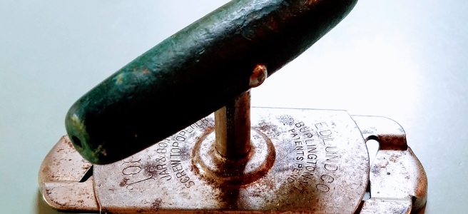
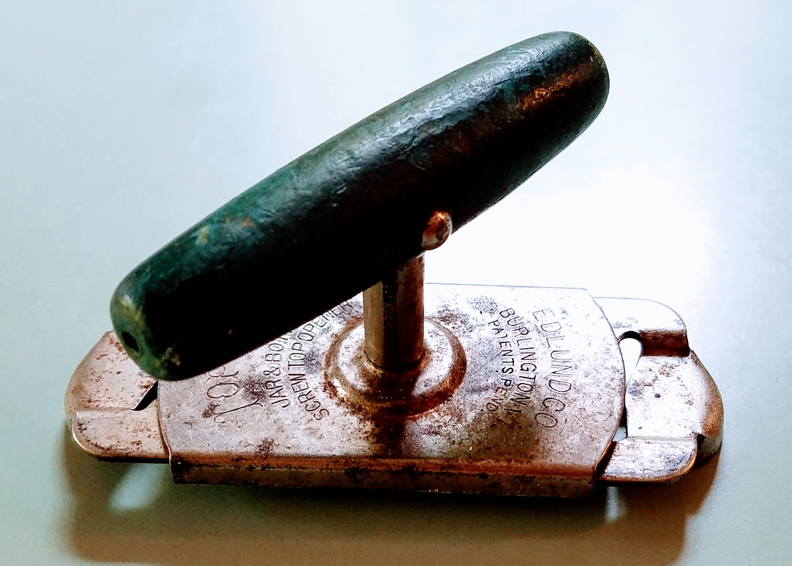
Top Off Cap Remover
This thing is called a “Top Off” and it was produced by the Edlund Company out of Burlington, Vermont. This company came into being in 1928 according to UVM.edu. They were a manufacturer of can openers and other kitchen items; founded by Henry, Oscar, and Walter Edlund.
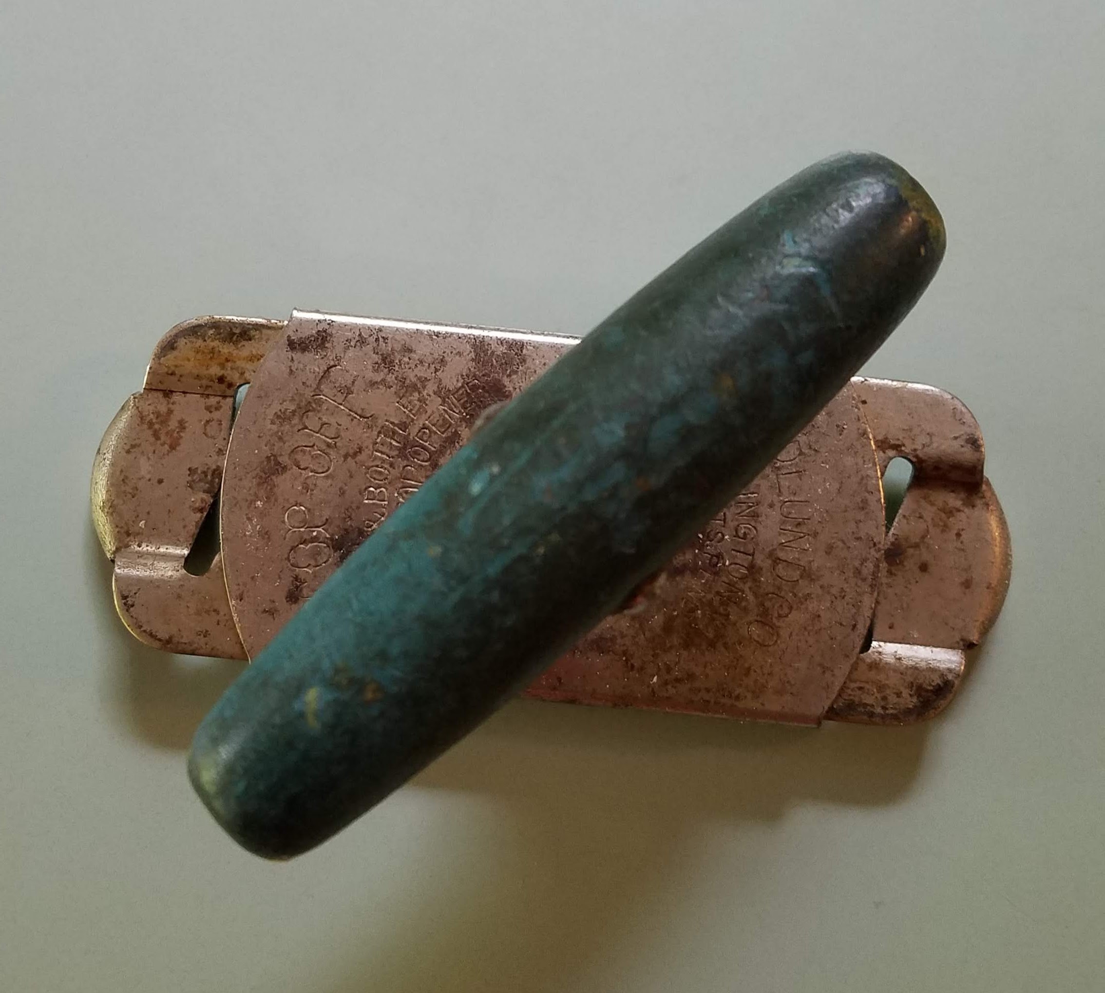
Top Off Jar & Bottle Opener
In 1931, the company had about 75 employees and “five different size can openers, ranging in price from $10 to 75 cents” (UVM.edu). I can’t imagine buying a can opener in 1938 for $10 which would now be the equivalent of $162 in today’s market! That must be a fearsome can opener! But I have to say, this one is still going strong even after all these years.
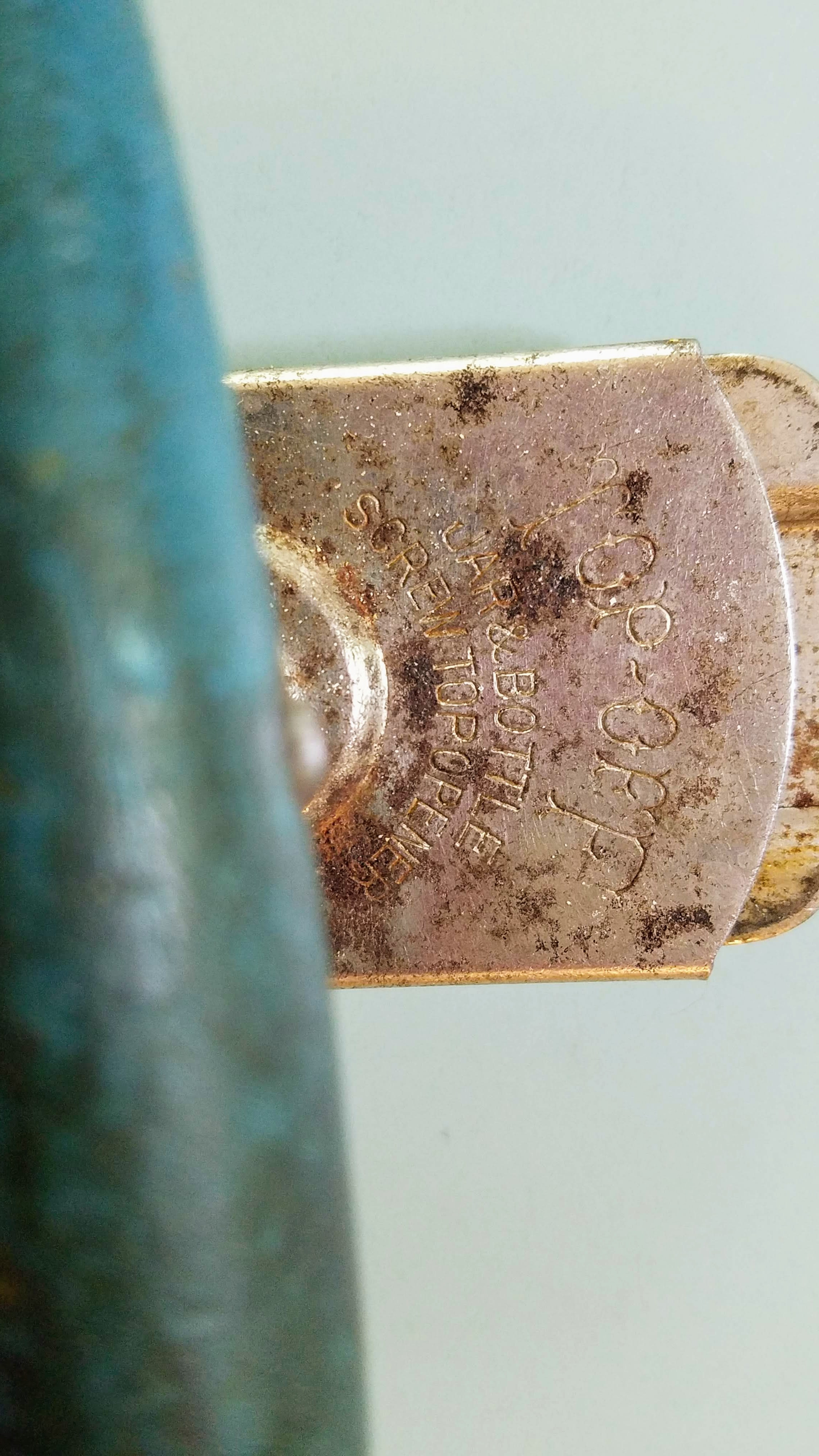
Underside of the Top Off Jar & Bottle Opener
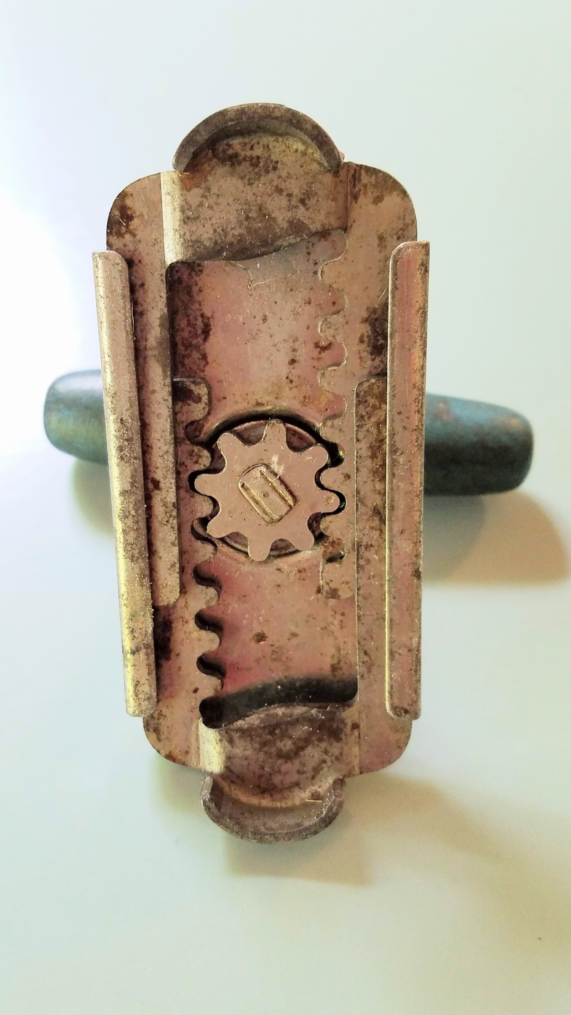
You just put this beauty on the jar, turn the top piece clockwise to open the sliding sides until the two sides fit over the jar, and then turn counter-clockwise. This simple machine uses the leverage of the handle and the steel grippers to pop the top off any jar I’ve had to open. Works like a charm! And is as solid as the day it was manufactured. This little gadget was developed sometime in the 1940s.
Side View Shows Sliding Ends
Turns out Edlund is still in business in Vermont, and they continue to produce high-quality kitchen and industrial items. I for one though, down to my vintage soul, will continue to love and use my 1940s Top Off. Don’t fix it if it ain’t broken!
I hope you enjoyed learning a little about this handy little gadget. It will never be in my Etsy store, unless I find another one. Then I may be convinced to sell any others I come across … maybe.
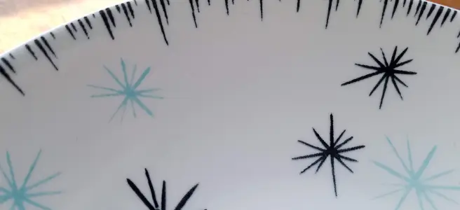
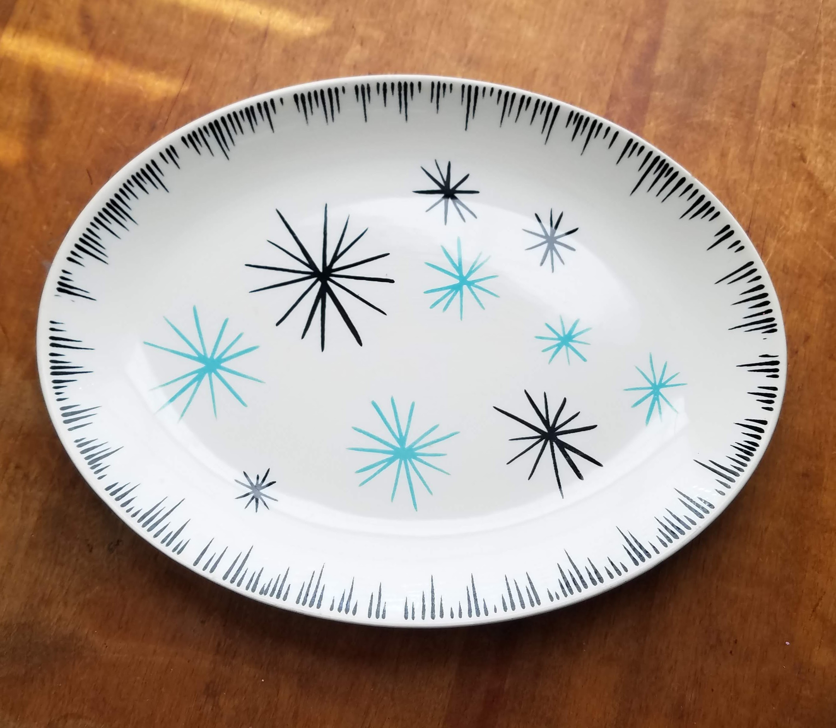
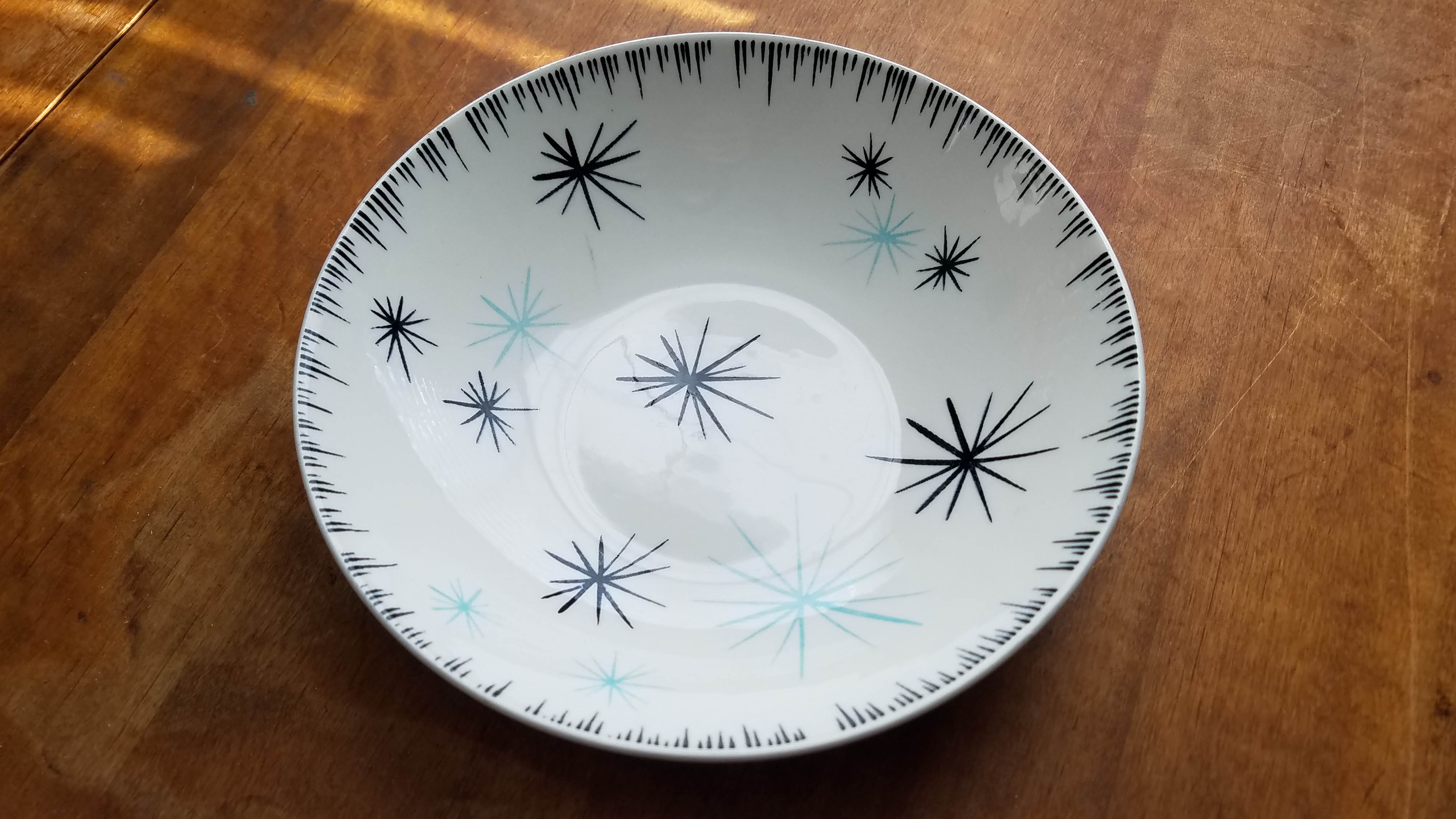
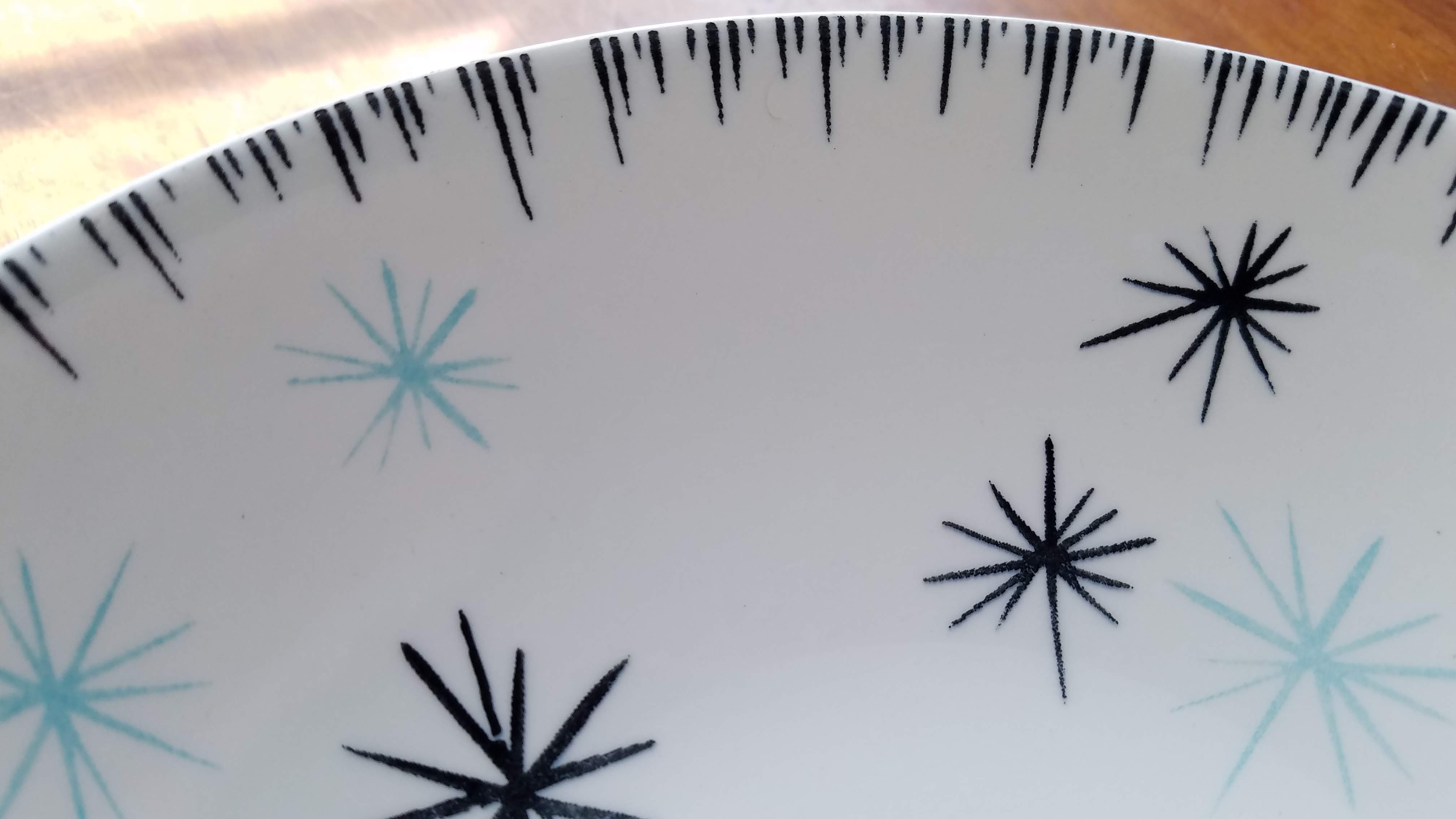
The other day in my travels, I ran across a pattern I hadn’t seen before. I was familiar with Homer Laughlin china, which I’ve actually posted about before and is archived here on the Vintage Eve’s blog. I had never seen this pattern, though. It was in their DuraPrint line. Also, new to me, as I hadn’t picked up any pieces in that line before.
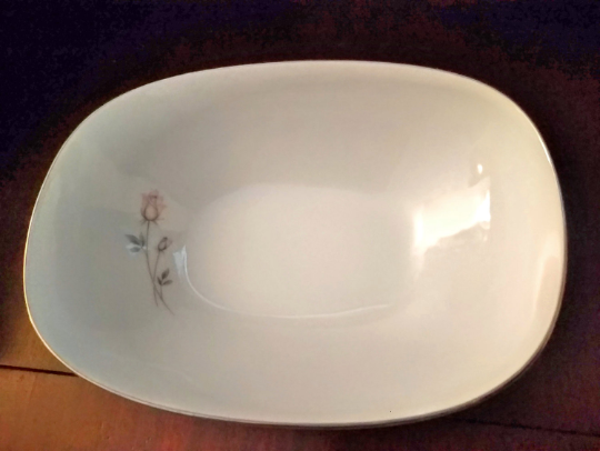
12″ Oval Platter
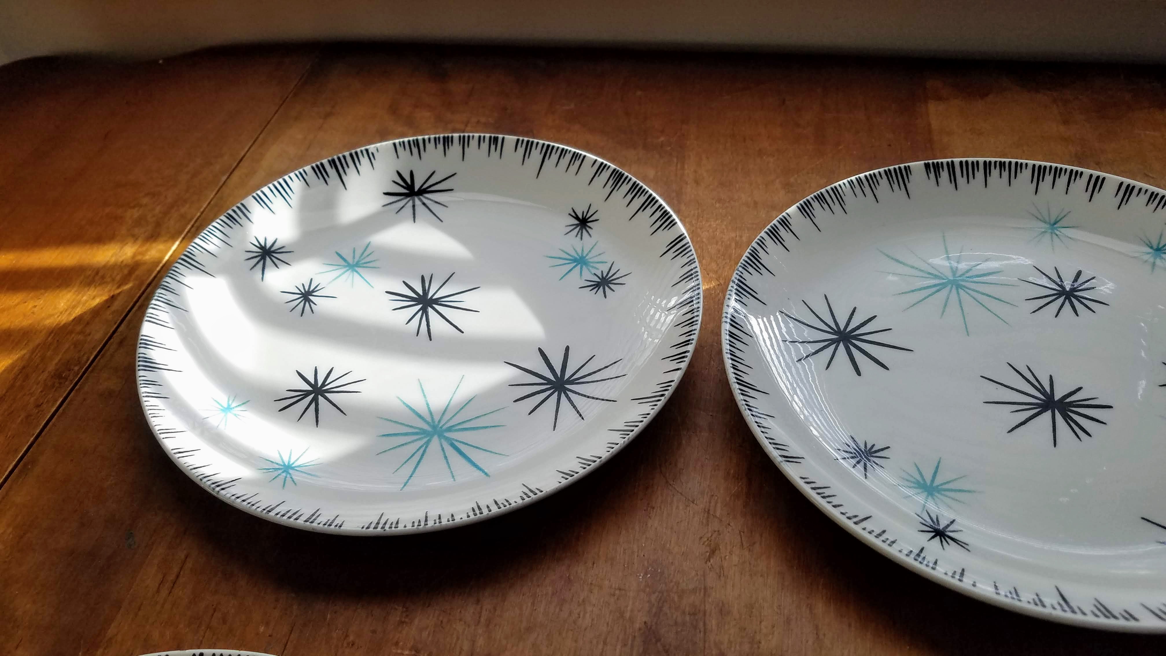
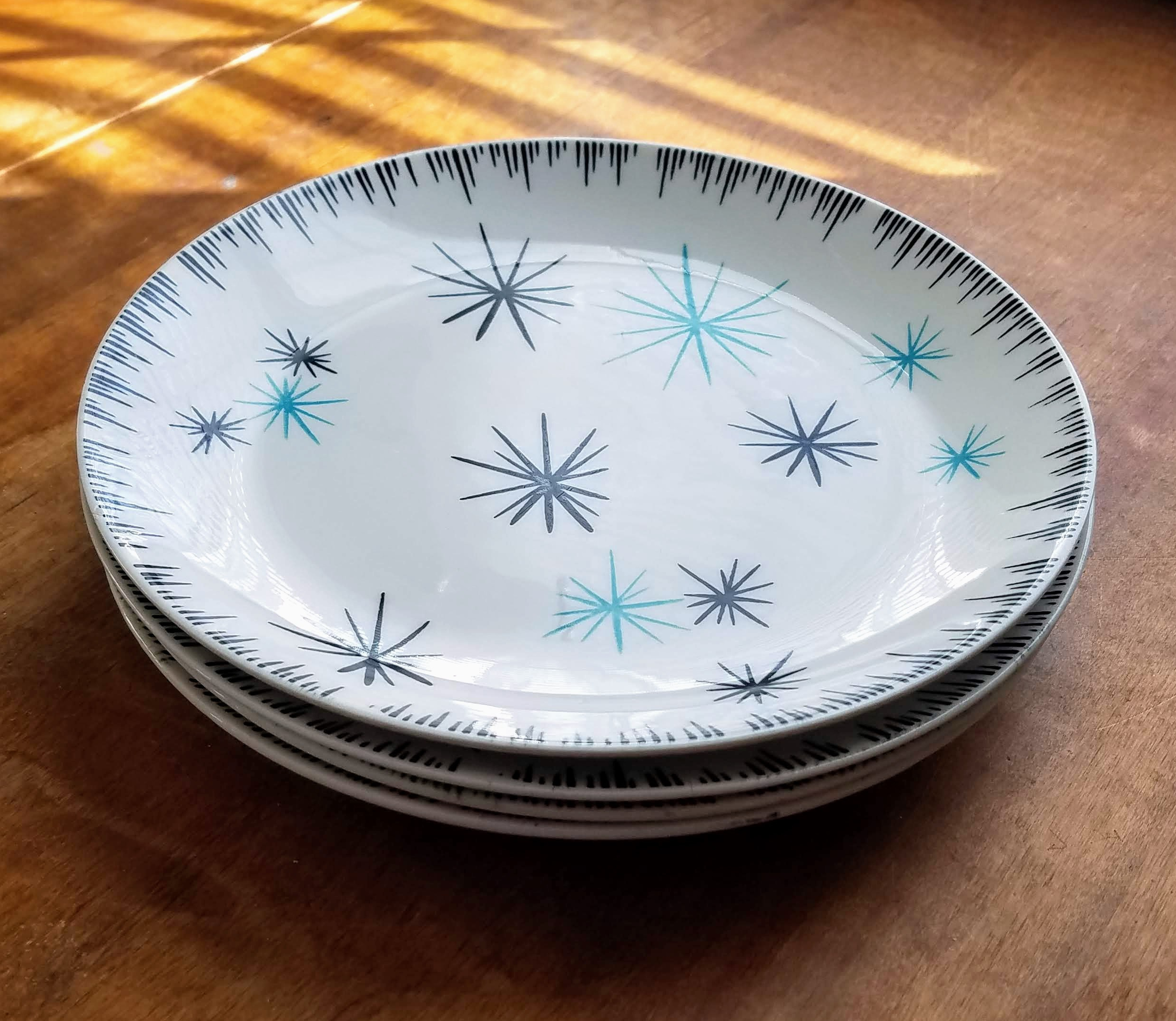
So this gorgeous pattern is called Star-Brite. If you look it up on Replacements, they list it as HLC1850 (HLC=Homer Laughlin China). It is so iconically 1950s with the black and aqua color scheme, and the atomic stars! I love it. I found two serving pieces and four dinner plates which have all since been listed in the Vintage Eve’s shop on Etsy.
Serving Bowl
DuraPrint was a rather interesting process. According to laurelhollowpark.com, DuraPrint was a design process in the 1950s where a bladder was filled with air, and the design was basically smooshed on to a piece as the bladder was inflated. The paint was forced through holes in a thin metal plate that was attached to the bladder, which then “stamped” the piece that was being decorated (Robbinsnest). I think it lead to a number of flaws, however, as the pieces I saw had some smears and missing spots. But they were not kidding about the name.
Up Close and Personal
Gorgeousness
Those pieces that I put in the shop are just as bright as if they were done yesterday. After the design was put on, a clear glaze went on top. Because the design was under the glaze, they stayed looking new. Interestingly, this process only worked on the flatter pieces. Sugar bowls, creamers, etc., were one solid color with no design because they were too round to work with the DuraPrint process.
Dinner Plates
So that’s DuraPrint. I hope you enjoyed this short look at an old process. I do love old china and dishware, especially the bowls — you know I do! Have a great week everyone!
I hope you have been enjoying this summer. Well, here it is summer. It’s been very hot and humid this year in southern New Hampshire, but life is good. Since we only really have three or four months of warm weather, I’ll take it!
As always, I have been on the hunt for new things to add to the Vintage Eve’s shop this summer. I’ve come across some nice pieces, too! I am definitely drawn to fine china. It’s part of my obsession with vintage kitchen stuff (as if you couldn’t tell from reading this blog), but that’s why I have the shop — to support my habit, which in turn allows me to buy more. It’s a circle.
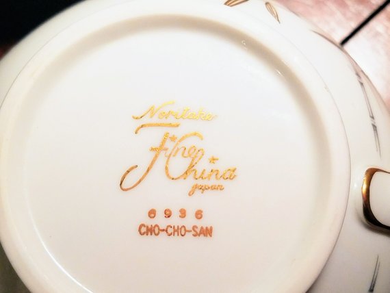
I happen to have a few pieces by Noritake and I was wondering the other day how long they have been in business. So, here we go.
Noritake Vegetable Serving Bowl in Pasadena Pattern circa 1960s
Noritake started as a trading company in 1876. According to Noritakechina.com it was the baby of the Morimura brothers. Ichizaemon Morimura decided to open an export business, mainly to keep money flowing into his country, and he sent his brother, Toyo, to New York to open Morimura Brothers, an import business. Very smart really. Morimura Brothers imported china and other items for sale in the U.S., exported by the other brother, Ichizaemon (Noritake.co.jp).
In Noritake, a small suburb of Nagoya, Japan, a factory was created in 1904, particularly to create fine porcelain dinnerware to export to the United States. It didn’t happen until 1914, though, that they were able to accomplish this feat. There was a lot of trial and error to get a dinnerware line that could be exported.
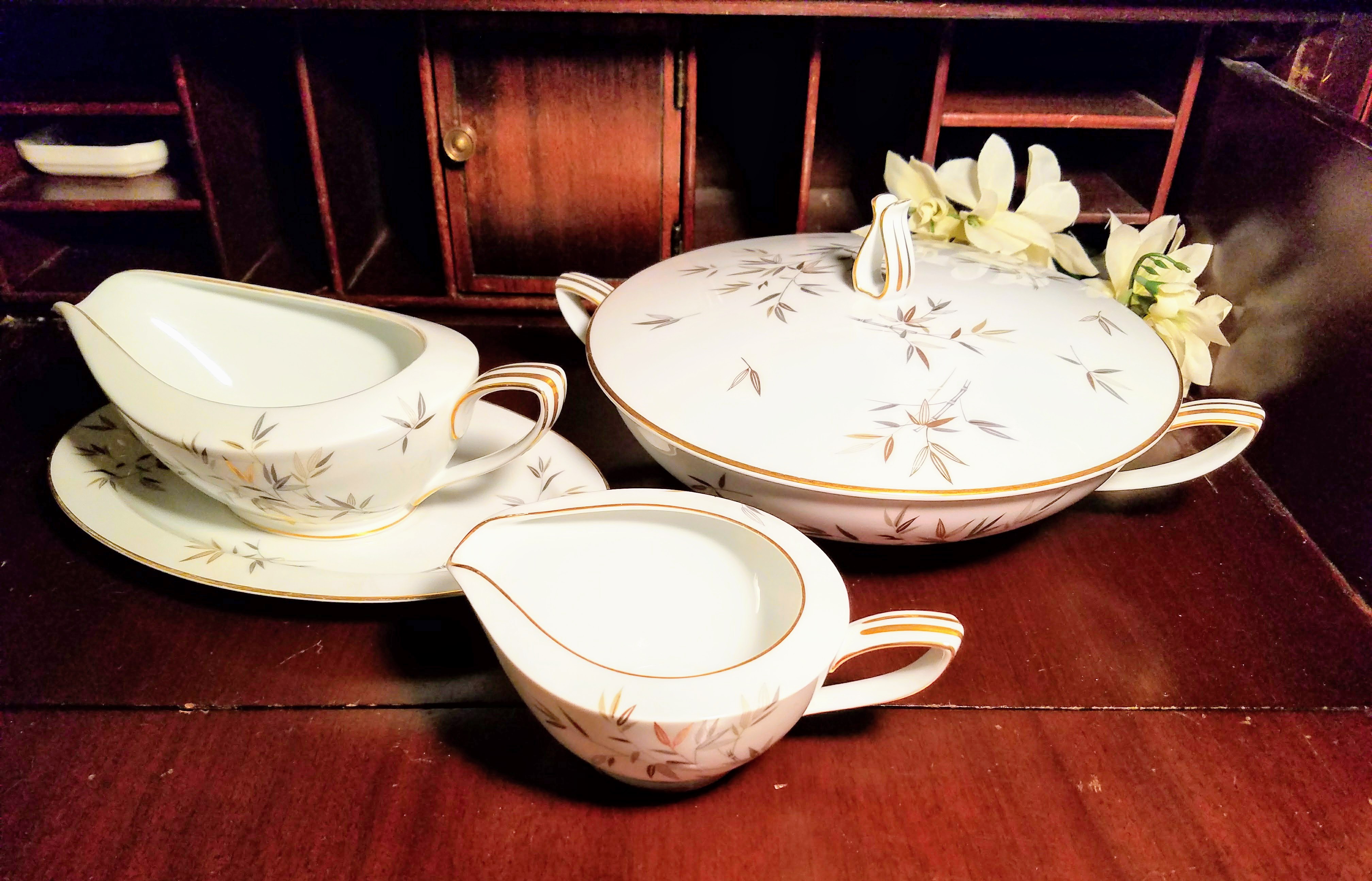
Noritake Cho Cho San Gravy Boat circa 1950s
Most of their designs were hand-painted in the beginning with a liberal addition of gold embellishment. As they grew, they perfected their manufacturing techniques and Noritake took off. Noritake china is now sold world-wide. Originally, the brand was called “Nippon Toki Gomei Kaisha,” which eventually became Noritake Company, Limited.
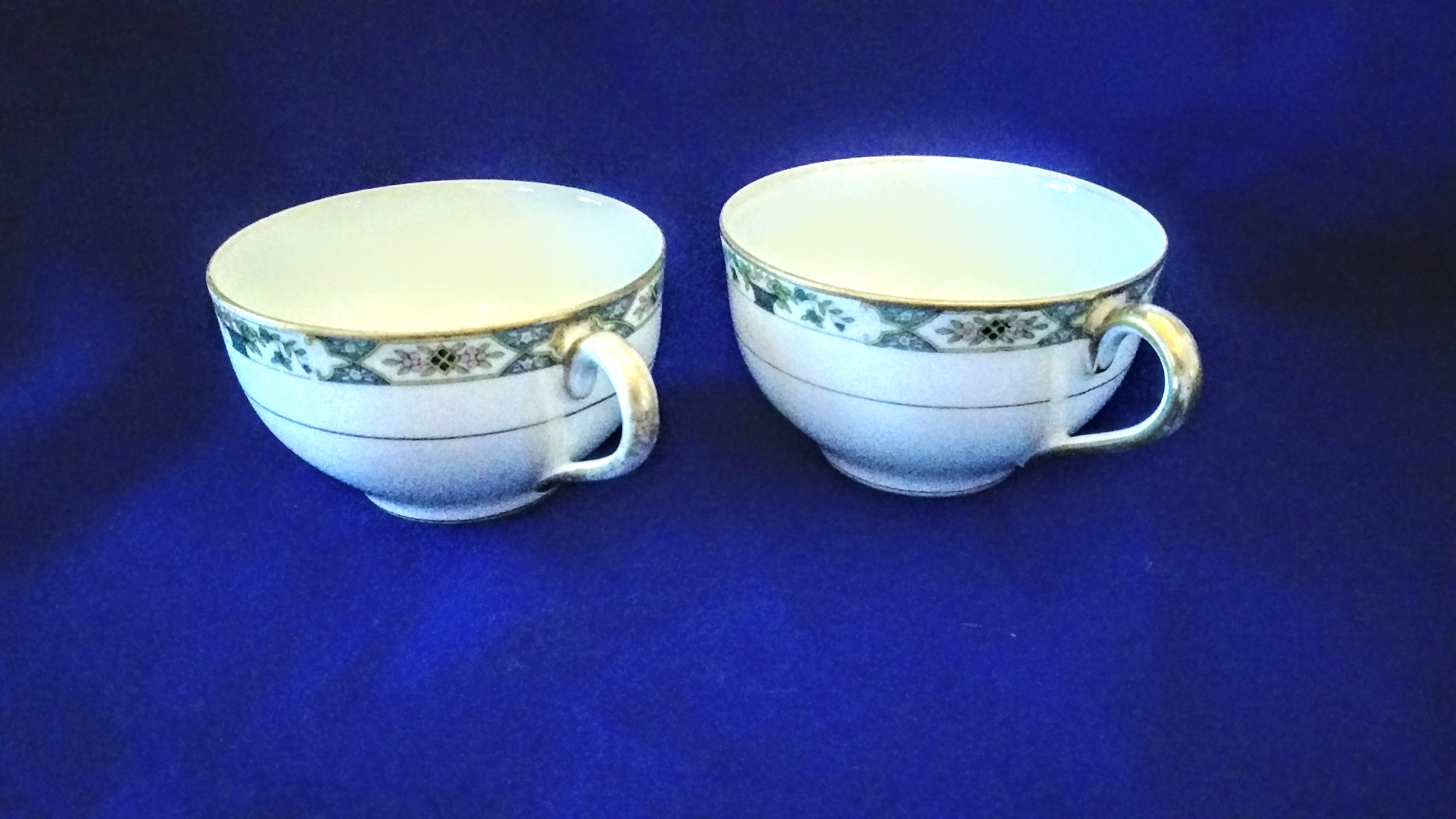
Flat Boullion Cups Rochambeau Pattern circa 1920s
Their backstamps, or porcelain marks, vary greatly. The earliest one is a circle with a “Maruki Mark,” dating to 1902. There is also a “Royal Sometuke NIPPON” mark that dates to 1906. One registered mark in 1908 is an “RC” underlined over a fulcrum with “Noritake” underneath. There is an extensive list of marks with pictures at http://www.noritakecollectorsguild.info/bstamps/. Check them out.
Noritake Cho Cho San Trio circa 1950s
It was very interesting that two brothers started this company, and that it is still in business. The company managed to diversify into many different fields, which served them well. Along with fine china, the company currently creates grinding wheels for various industries, their printing and color mixing techniques are used in technology, including automobiles, and their engineering techniques are used in yet other areas of industry. They survived during the Occupation years after WWII, and continued to create and diversify into present day.
Noritake Fine China Back Stamp circa 1950s
I hope you enjoyed learning about this company with its rich history. Japan itself is a beautiful country. My daughter recently returned from a school trip there, and her pictures are amazing.
I hope that you enjoy the rest of your summer (if it’s summer where you are!). I will enjoy the roughly 60 days before it turns colder here, although, I’m more a fan of Autumn in New Hampshire, anyway. If you’ve never experienced a Fall in New Hampshire, with the burst of oranges, golds, and reds, it’s amazing, and only lasts a month, maybe a month and a half if you’re lucky. I’m hoping for a long Autumn before the snow flies. Have a great week!
There’s been a number of new things added to the shop recently. As you know by now if you’ve been reading this blog for any length of time, I like to find the backstories and histories on my pieces. However, now and again, there just isn’t much information on a company or a piece. That doesn’t mean that they don’t deserve a mention! So here are some honorable mentionables.
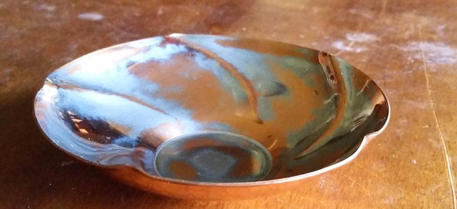
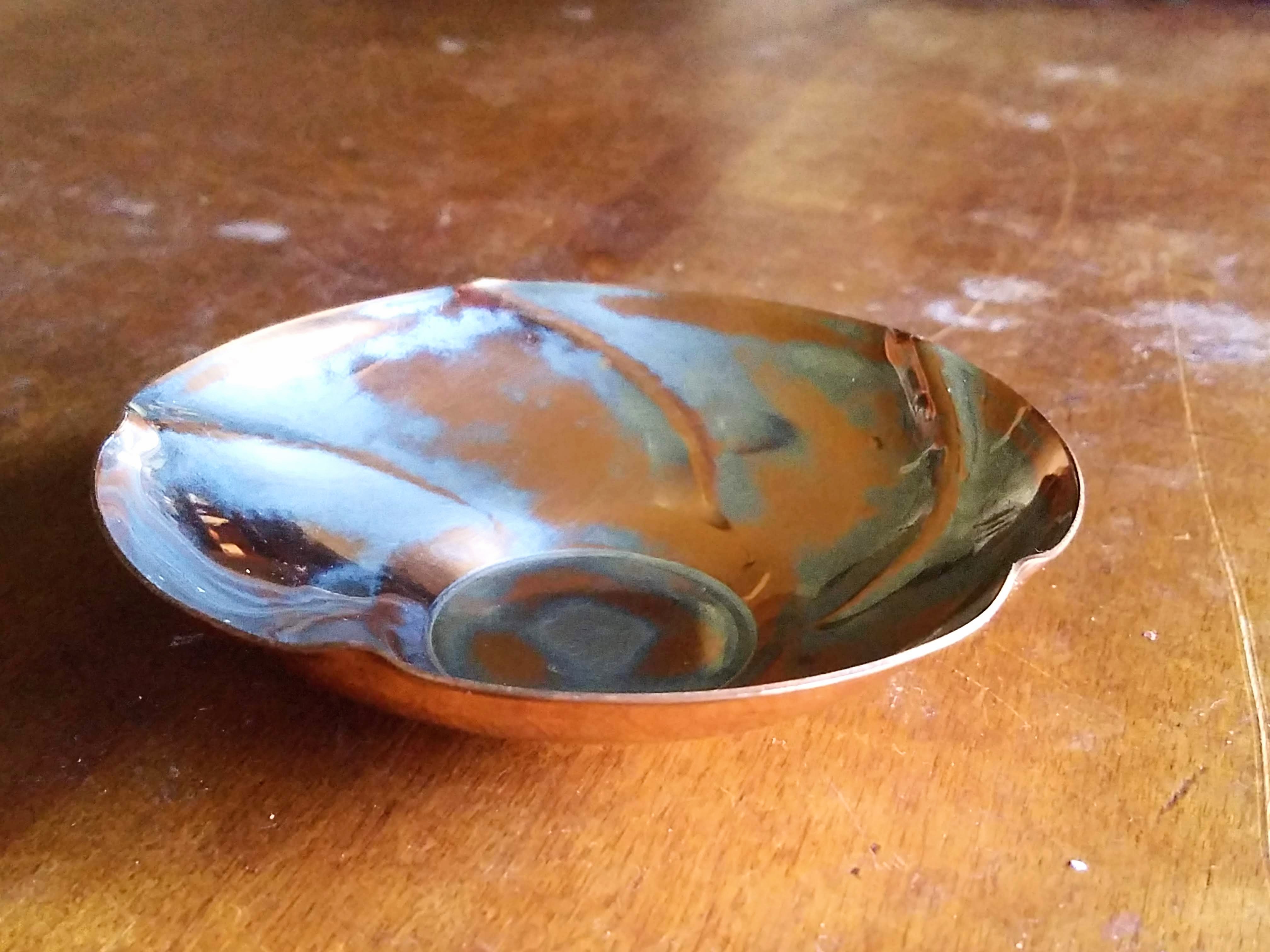
Take a look at this gorgeous copper bowl!
Copper Bowl with Silver Wash by Peter Manzoni Boston Metalworker circa 1930
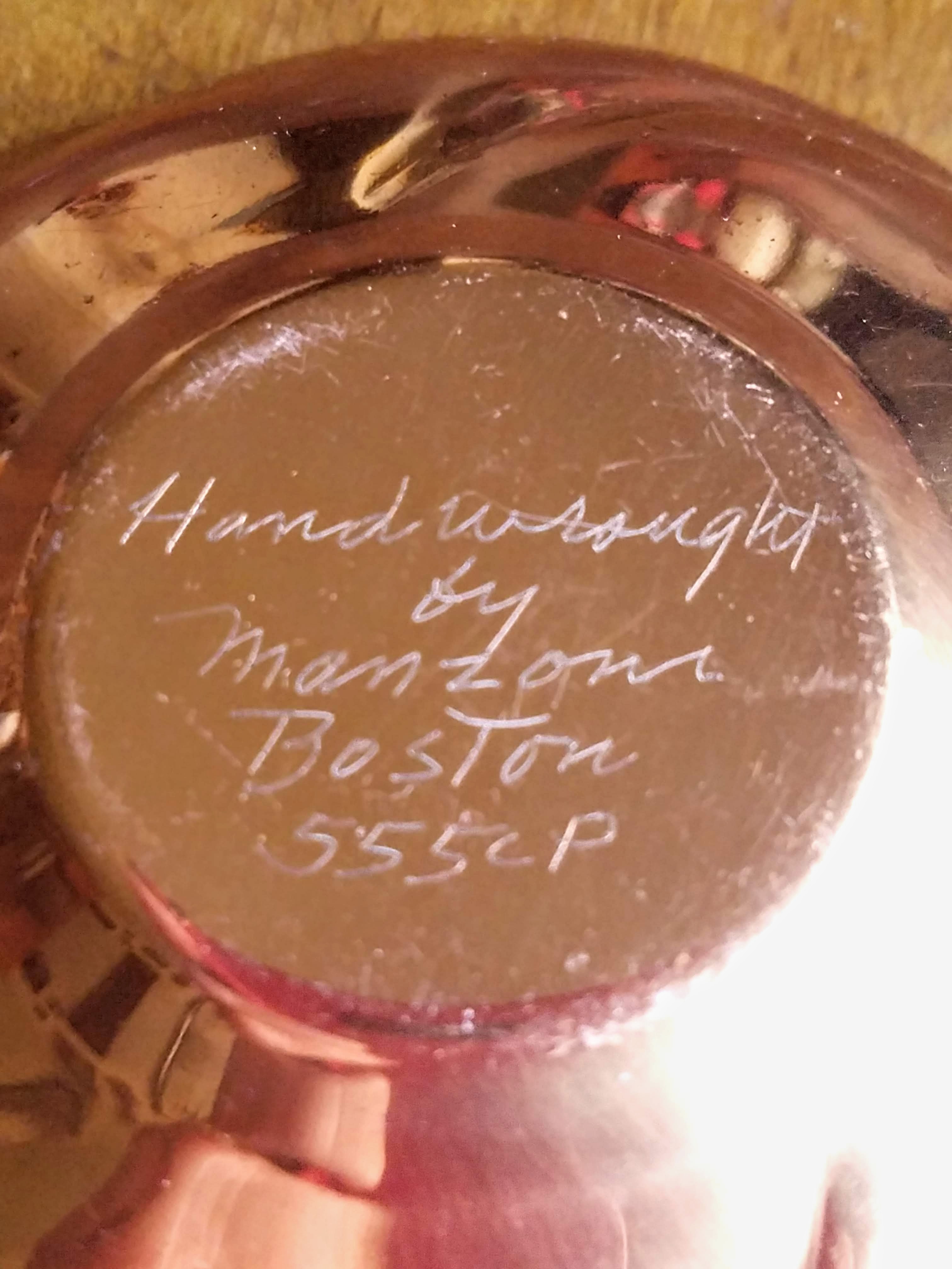
Signature of Artist
I’ve had this beautiful copper bowl for a bit in the store, however, there is very little information about the maker. Peter Manzoni was a metal worker back in the 1920s in Boston, Massachusetts. The bowl is beautiful, shaped like a flower with a gorgeous silver wash that complements the copper and the shape. It’s small, at only about 4 1/2″ across, but it’s got style for miles. It’s signed on the bottom, and is one of his better known shapes.
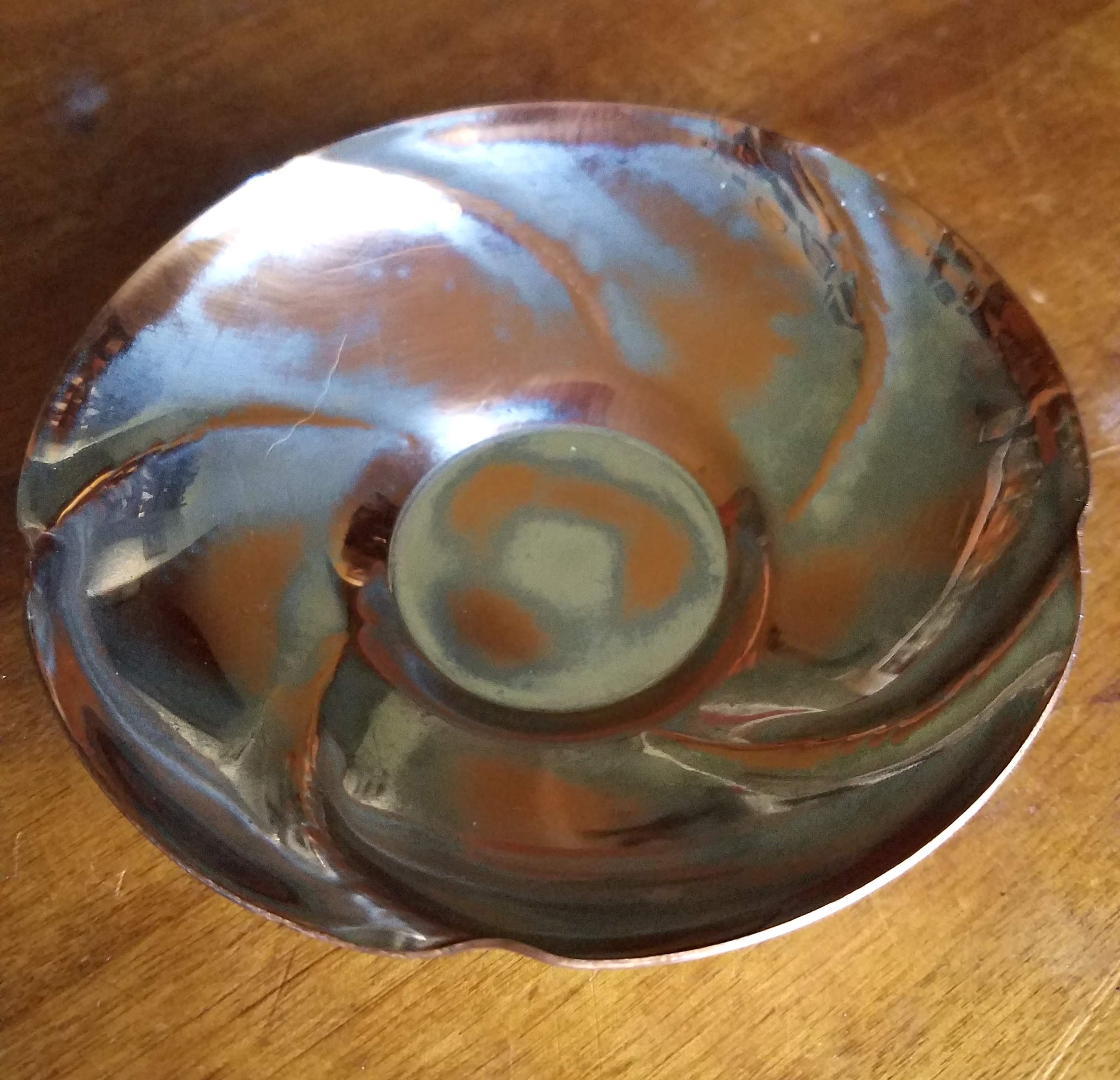
Side View of Manzoni Bowl
All I can find out about him, though, is that hewas part of the Boston Arts and Crafts Movement. He was a metalworker who also contributed to a book called “Metalwork for the Amateur” in 1936. He also partnered later with Angelo Martini to form Manzoni and Martini Art Metal Company. That’s about what I know of this amazing metal worker. If anyone has anymore information, please share in the comments!
Here’s another one …
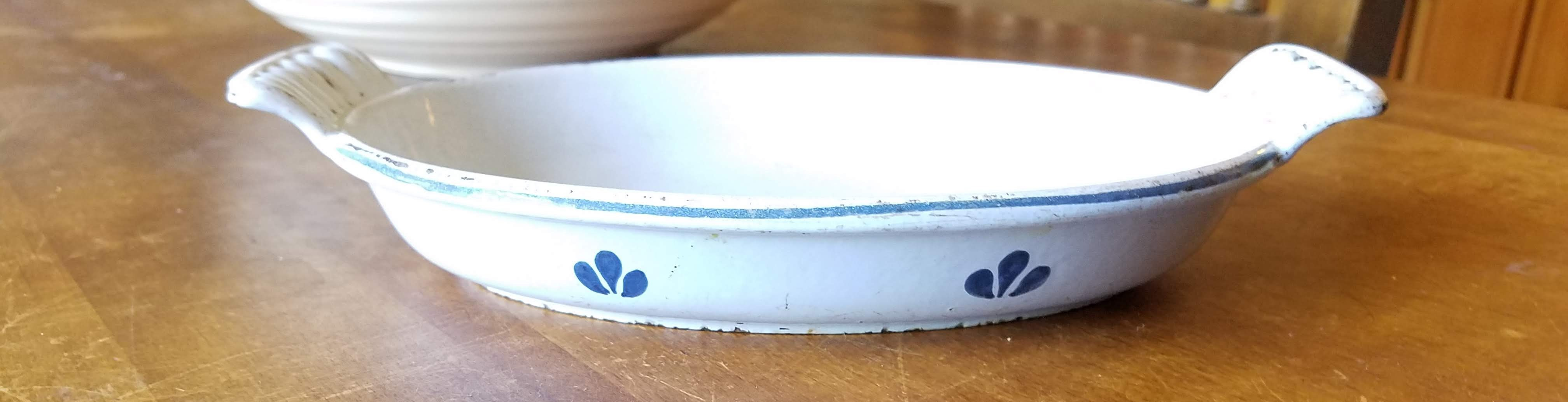
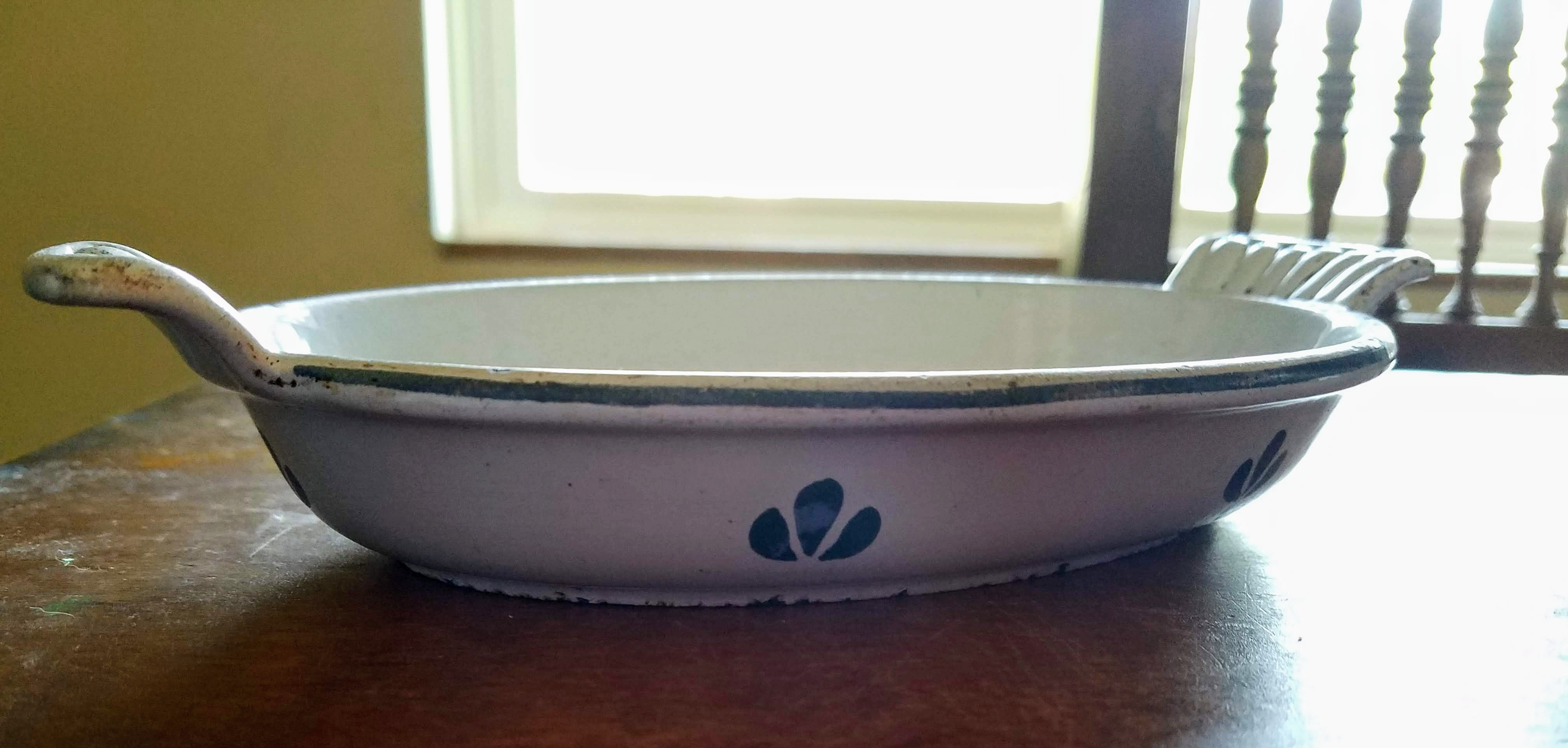
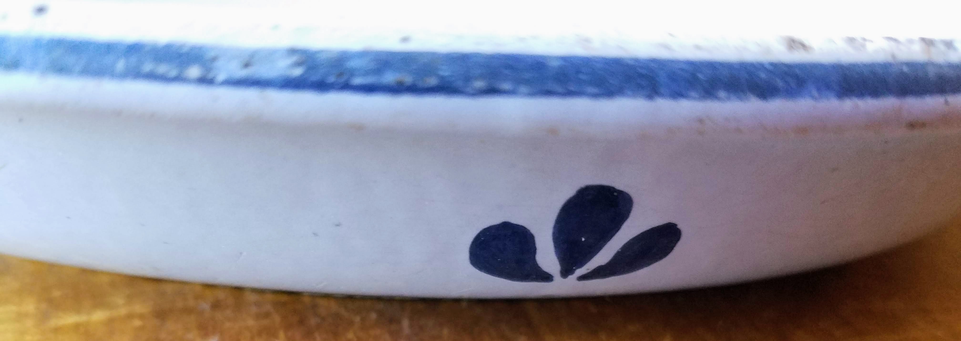
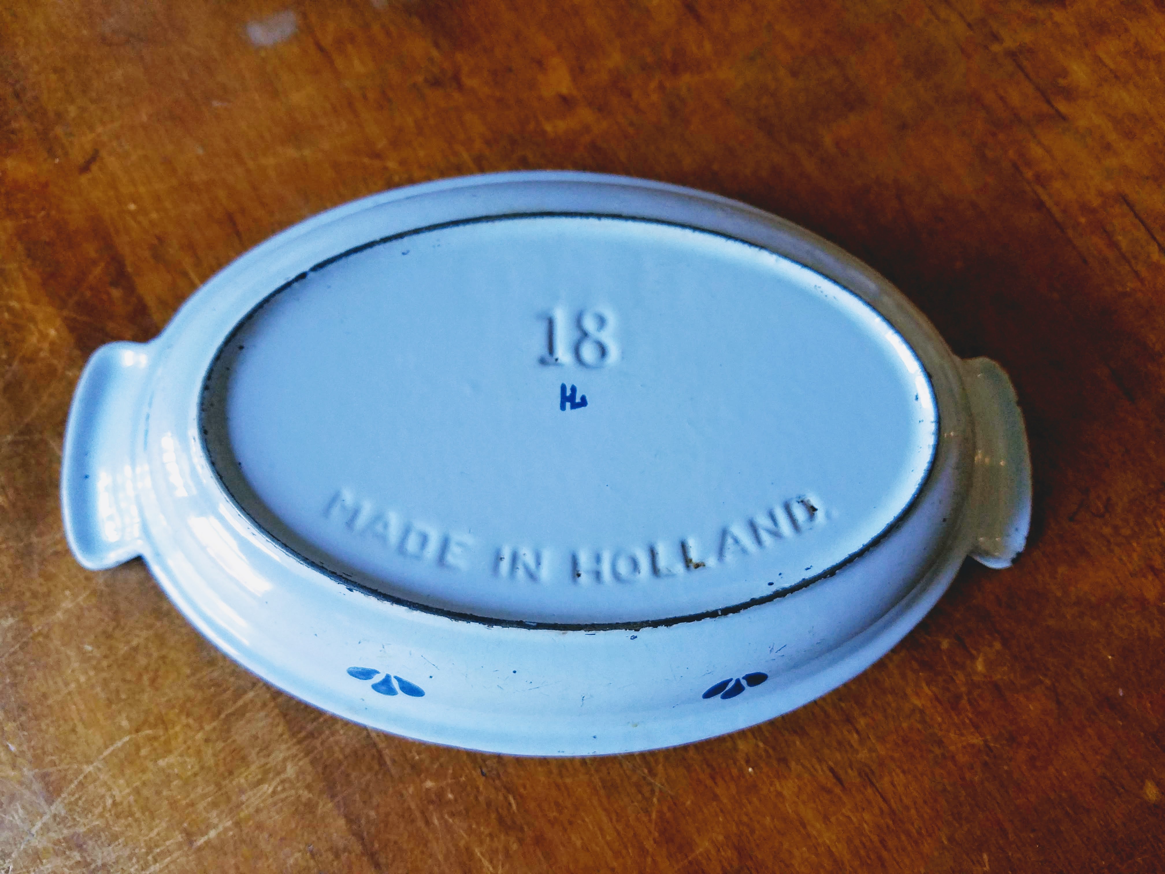
Dru Holland Enameled Cast Iron Au Gratin Casserole Dish circa 1960s
This is a Dru Holland single casserole baking dish. Dru was a popular company during the 1960s due to a resurgence in enameled cast iron. This stuff is durable, although prone to chipping. Unfortunately, there’s not a lot about the company that I can find. Most of their stuff that I’ve found is either light blue or mint green with these tulip designs or other flowers. It was made from the 1930s to the 1960s. Love the look.
Dru Holland Blue Tulip
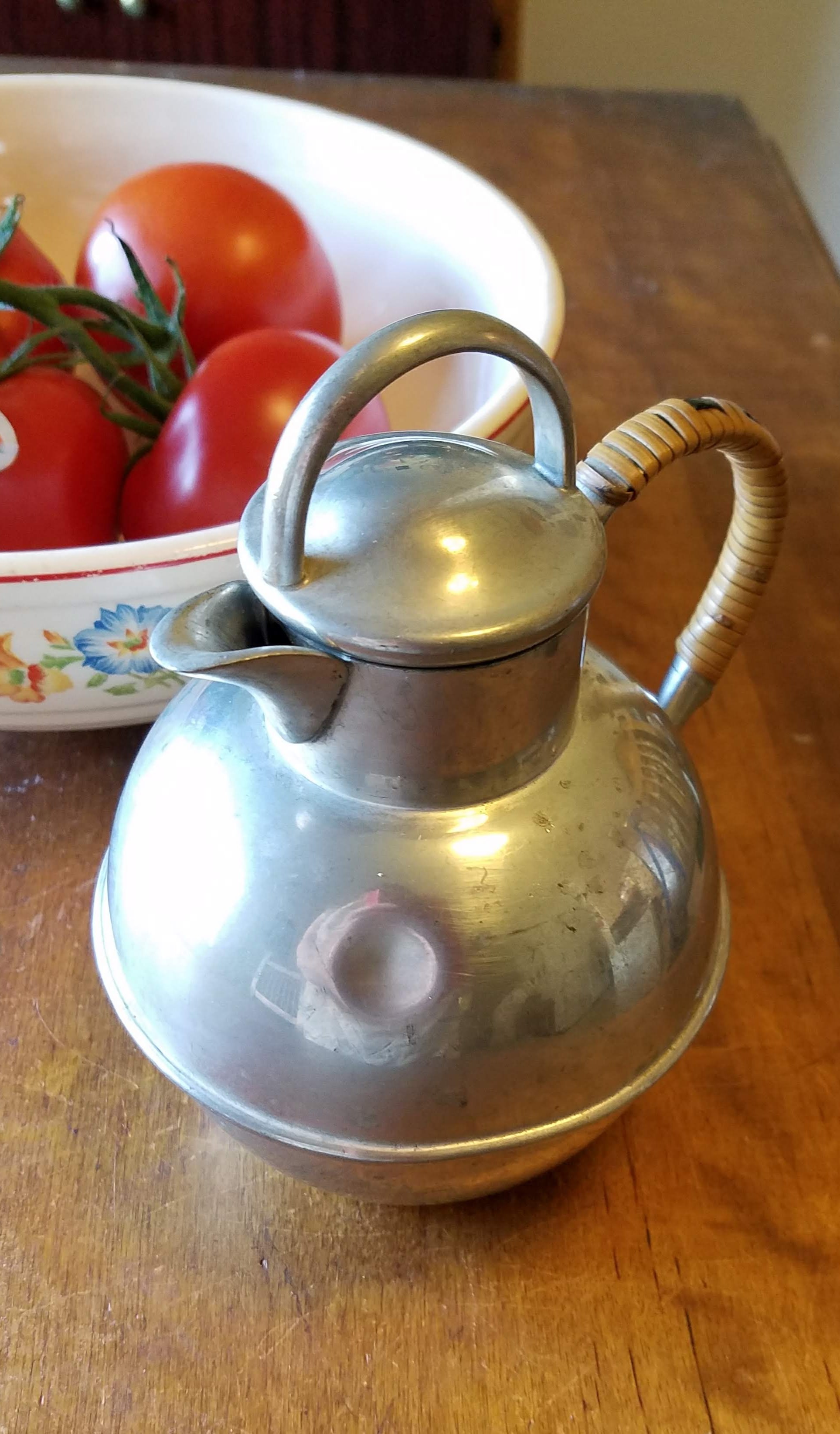
Finally, there’s this adorably round pitcher
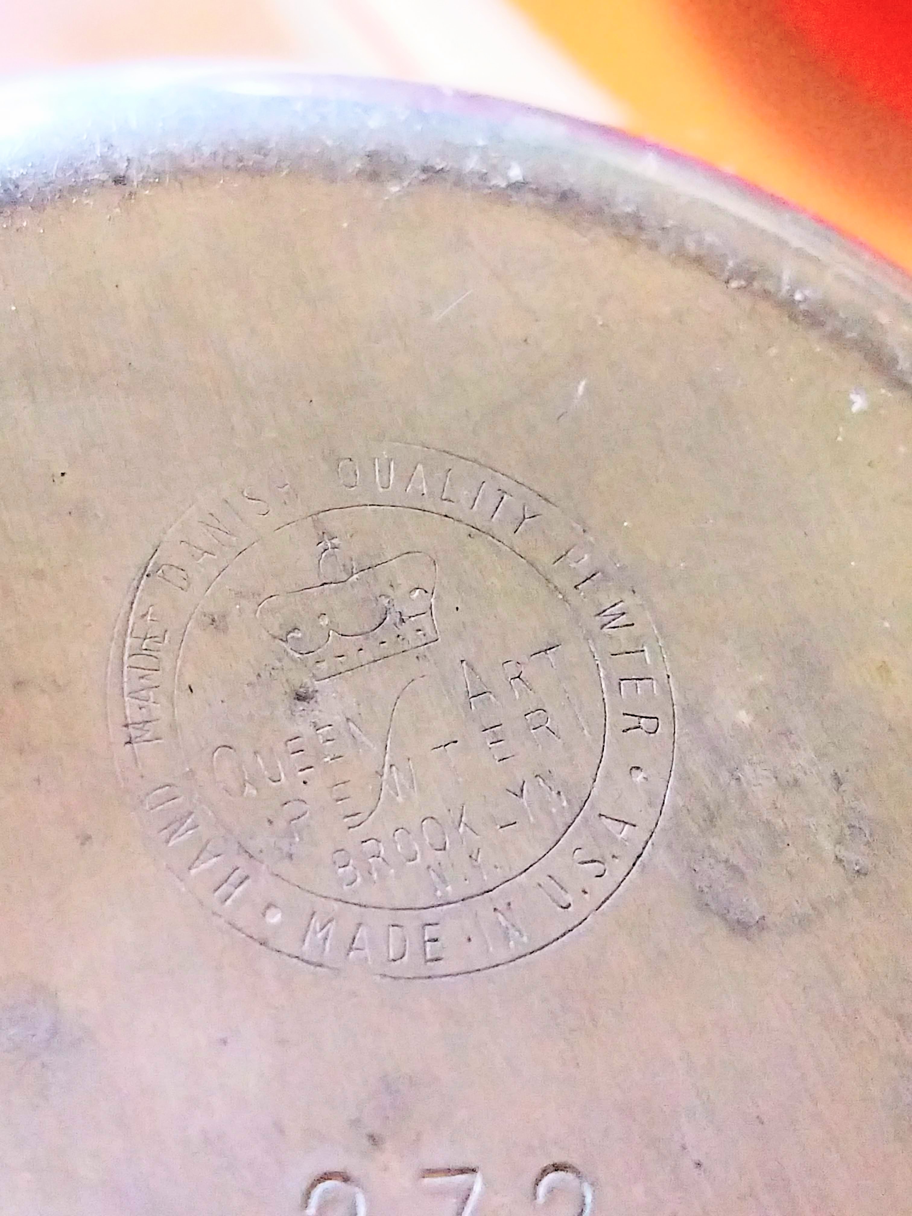
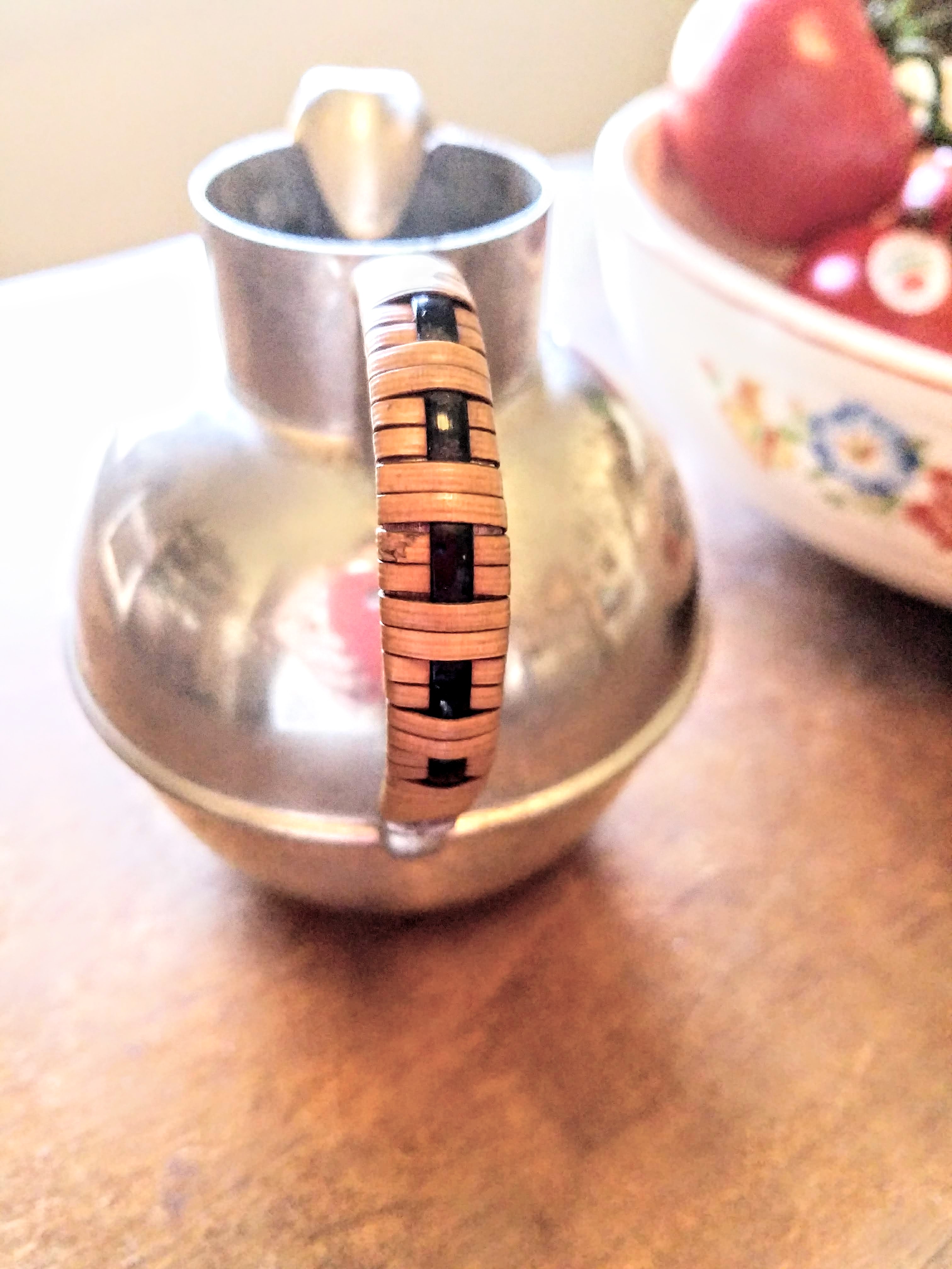
Danish Modern Queens Art Pewter Pitcher with Rattan Wrapped Handle circa 1960s
It was made by Queens Art Pewter. The company was in business from the 1930s to the early 2000s. I know that the “Queens” part of their name comes from Queens, New York, which is where they were based, and that 80% of their products were pewter. They also had a silver line. But that is all I’ve been able to glean about them.
Maker’s Mark
Rattan Wrapped Handle
So there are three pieces that I have in the Vintage Eve’s shop that are really cool, but that I can’t seem to find much information on, one way or the other. If any of you have information on any of these pieces, please share in the comments! I love to hear from you.
I hope you have enjoyed this quick peek today. Have a great week!
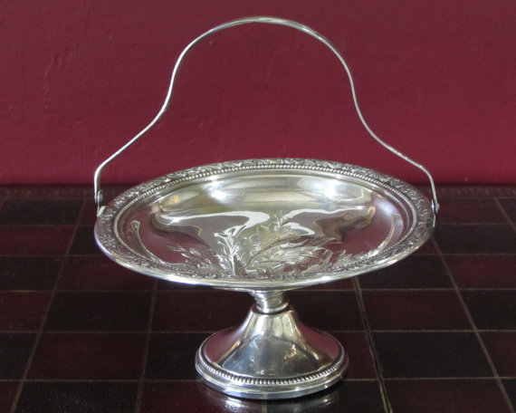
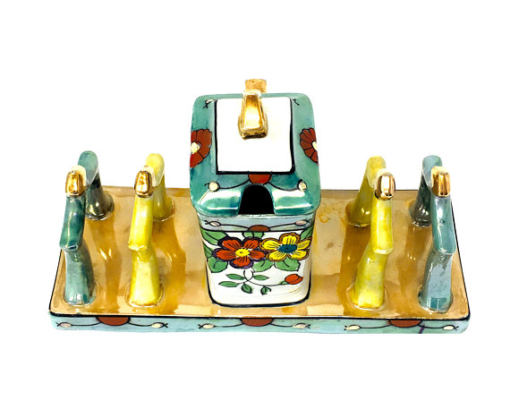
Awhile ago, I found this beautiful set of silver ashtrays and lighter in its original box. Boy, they really knew how to package things back then. These are from the 1920s. Whether you smoke or not, you cannot deny the craftsmanship of this set. The glass and silver are beautiful together.
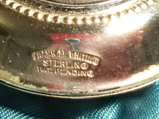
Frank M. Whiting Ashtray and Lighter Set
The mark on them denotes “Frank M. Whiting Sterling.” So who is this Frank M. Whiting who does such gorgeous work? When did he start working in silver? I need to know, so let’s jump into this rabbit hole together and find out a little bit about Mr. Frank M. Whiting!
Frank M Whiting Sterling Nut/Candy Dish (available at Nathan H Antiques)
According to a thesis on the Whiting Manufacturing Company by Abigail Barnes Nova, the story actually starts with his father, William Dean Whiting (1815-1891) who was a silversmith. William Dean worked his way up through different apprenticeships and firms until he helped found Whiting Manufacturing Company in 1866 in Attleboro, Mass. After an extensive fire that destroyed the operation, they rebuilt in Attleboro before they moved to New York City in 1875.
Frank M Whiting Ink Well or Toothpick Holder (available at Grammahadthat)
This is important information in that it shows the progression of Frank M. Whiting’s early life. He would have moved with his family as the company moved. The company excelled in lines of Japanese-inspired silver in competition with Tiffany. As a side note, Charles Osborne was also a designer for Whiting Manufacturing Company, and he was later associated with Tiffany.
Frank M Whiting Silver Porringer (available at BirneyCreek)
In 1880 we see Frank Mortimer Whiting enter the scene. As the second son of Frank Dean Whiting, he and his dad returned to Attleboro and opened the F.M. Whiting Company. He had worked for his father’s company in both Attleboro and New York City as an assistant. He also worked the sales end of things as a traveling salesman. He wasn’t actually a designer at Whiting Manufacturing Company; which is interesting, he was a businessman.
Frank M Whiting Silver and Glass Compotes (available at UglyDucklingLex)
His dad, William Dean may have actually done most of the designing with other silversmiths doing the work. Unfortunately, poor Frank M. appears to have died early. He died in 1892 about a year after his dad. His sisters ran the business under the F.M. Whiting Company after that until they had to change the name in 1895 to “Frank, M. Whiting and Company” and get a whole new trademark. This was because the Whiting Manufacturing Company didn’t want them to make any money off of the name association.
The Frank M. Whiting Company ran until the 1940s when they were bought up by the Ellmore Silver Company and ceased to exist (Metropolitan Museum of Art, “In Pursuit of Beauty: Americans and the Aesthetic Movement.” p. 485). So that places my set of ashtrays and lighter as manufactured sometime between 1895 to 1940. It happens to be a 1920s design but that’s how you date your items. Frank M. Whiting & Company didn’t come into existence until 1895 and F.M. Whiting was only in business from 1880 until 1894.
Frank M Whiting Silver Tazza (available at Whatnotgems)
So there is the story of Frank Mortimer Whiting and his silver company. I hope you have enjoyed reading! Have a great week!
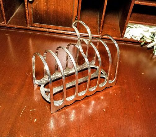
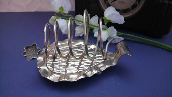
I recently added to the Vintage Eve’s shop, and quickly sold, a lovely little silver-plated toast rack. In researching how to price it, I saw so many pretty toast racks it made me wonder how far back these go? Also, when did they actually start making toast? So of course that led me to when did they decide they needed a rack to stand them up and why?
Here is a picture of the toast rack that started this short jaunt.
William Hutton & Sons Toast Rack 1930s
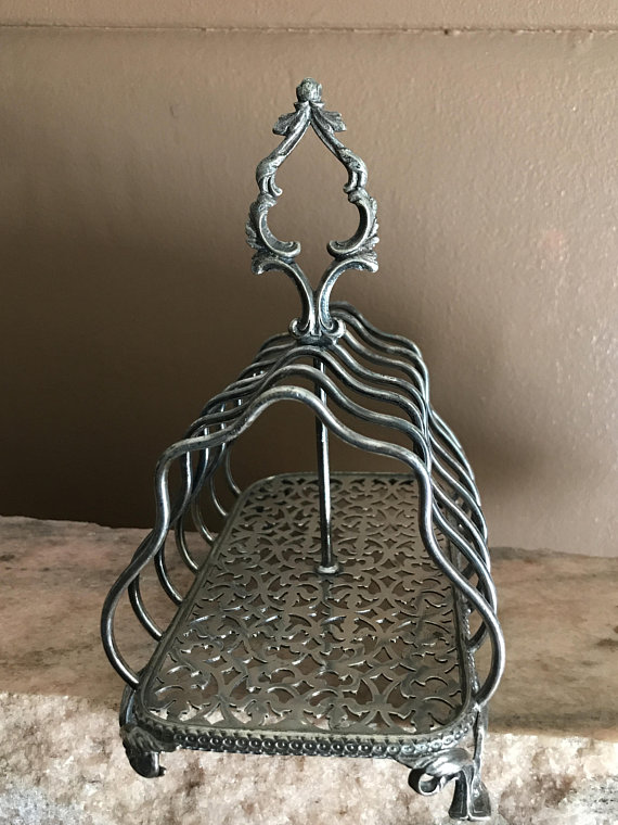
The top is a little squished, but it is almost 100-years old, and one must forgive some flaws in a piece that old. Here’s a unique one in Lusterware from the 40s.
According to a New York Times article, toast has been around for awhile. It comes from the Latin “Torrere” which means “to burn.” While burnt toast isn’t the ideal, they actually originally used toast to flavor alcohol. They usually used stale bread that would hold up to toasting in the fire. They had toasting forks so they could hold the toast in the fire until it was just the right color.
James Deakin Toast Rack 1900s Art Nouveau (available at Vintage and Deco)
The first toast racks seem to have come into existence sometime in the late 1700s, that comes from a mix of different sources. They all seem to agree that the 1770s is about the right time. They were simple devices at the beginning, just wire soldered to a tray type of thing. They got more elaborate as people started using them.
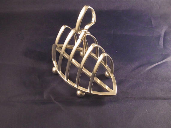
James Dixon Toast Rack 1910s (available at Museography)
They were used because it kept the toast from getting soggy and the crumbs would get caught in the tray, keeping everything neat and tidy. There are some really wonderful examples of toast racks out there.
People tend to use these as letter holders these days, or they did until email took the place of snail mail. Time marches on, you know. I’m sure we’ll find another use for these. Maybe we might even go back to using them for toast!
I hope you’ve enjoyed this foray into toast racks. Enjoy your week!
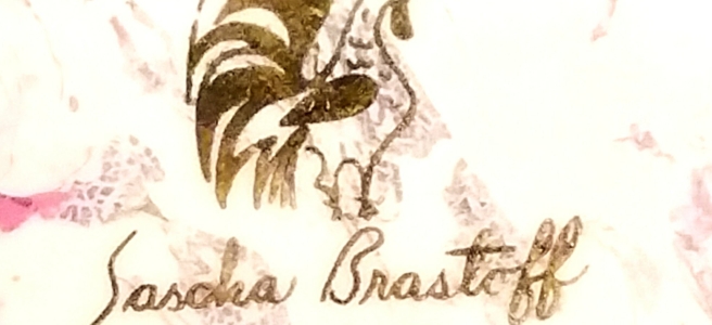
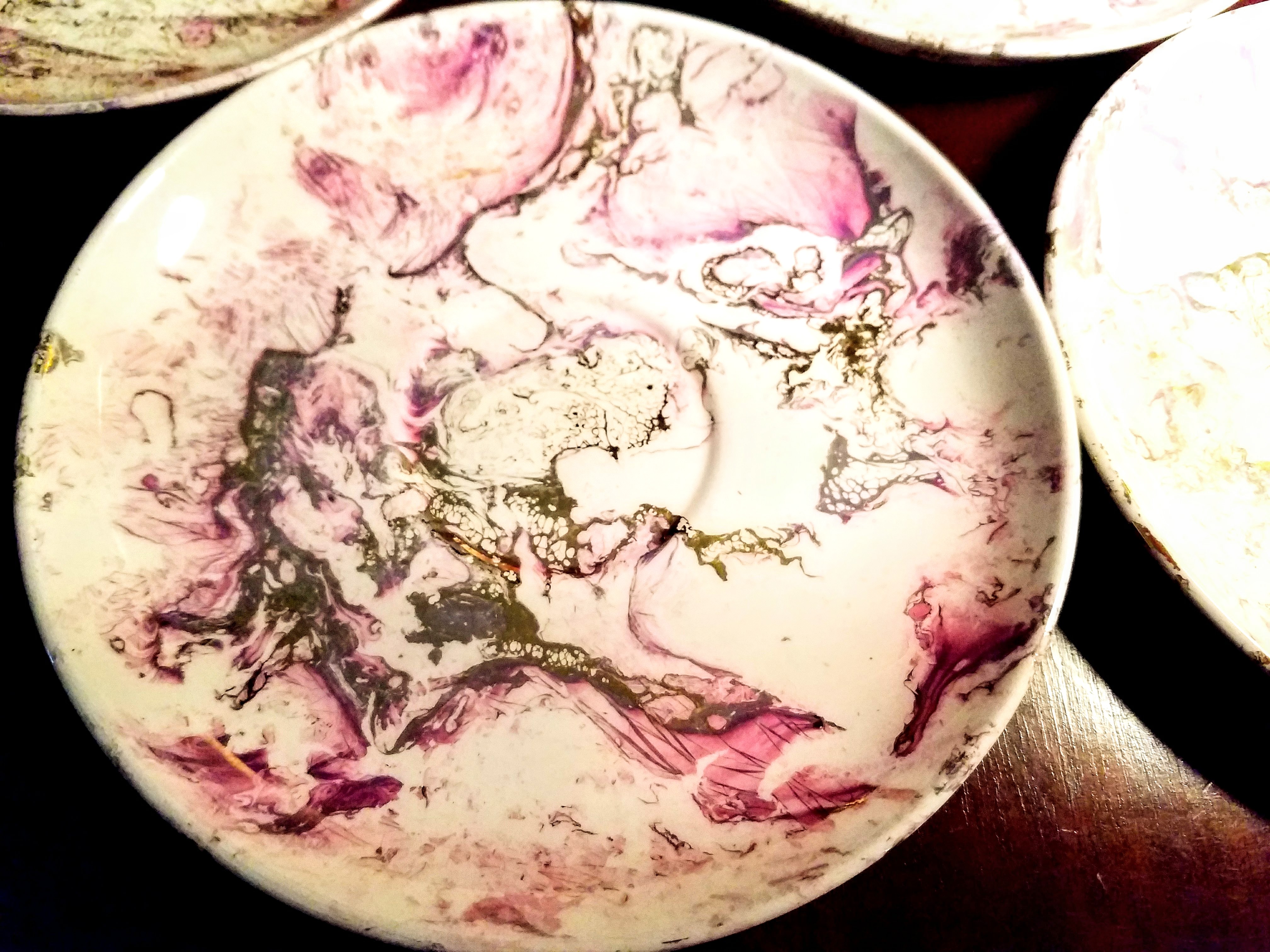
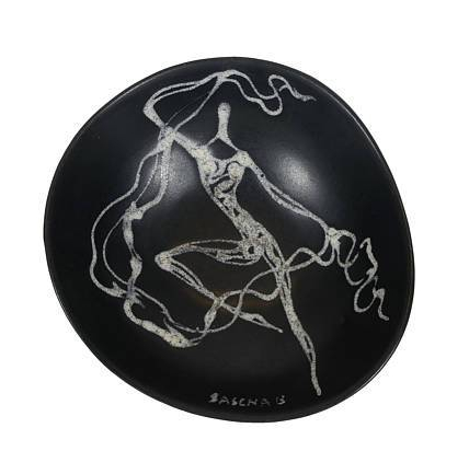
I really love finding stuff I’ve never heard of before. Some of the pieces on this blog have caused me to really look deeper into the origins of pieces, which is what I also love. So recently, I came across these pieces. Other than just being an absolutely beautiful design, they were by a designer I was not familiar with, Sascha Brastoff.
Sascha Brastoff Saucer
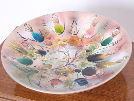
Surf Ballet
These saucers are a pinky-purple mixed with gold on an eggshell color base. The pattern name is Surf Ballet, which, let’s face it, is an awesome name. And it also looks like the foam from the ocean as it’s churned with a gorgeous sunset. That’s why I grabbed them for the store. They were too pretty to leave them languishing in a cupboard.
Sascha Brastoff Horse Bowl (available at Buddhagal)
So who is Sascha Brastoff? It turns out he was a very popular designer of Mid-Century Modern ceramics and was very prolific during the 1950s and 1960s. He was born in 1918 in Cleveland, Ohio. He entered WWII going into the Air Force. When he got out, he actually worked for a while at Twentieth Century-Fox as a costume designer.
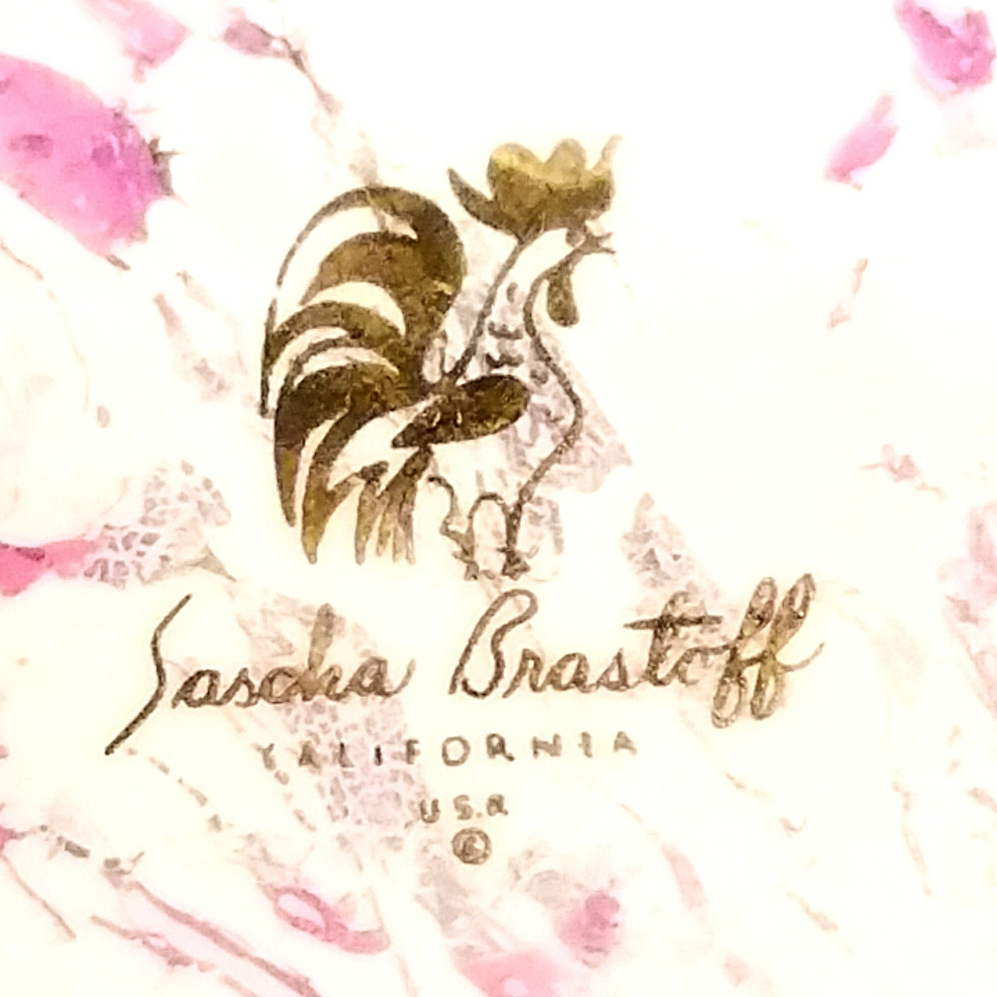
In “Made in the Twentieth Century: A Guide to Contemporary Collectibles” by Larry R. Paul, Sascha opened Sascha Brastoff Products, Inc. Then opening a ceramics plant in West Los Angeles in 1953, introducing his Rooster trademark that same year.
Sascha Brastoff Rooster Mark
One of my favorite resources on American pottery, “Lehner’s Encyclopedia of U.S. Marks on Pottery, Porcelain & Clay,” by Lois Lehner, says this plant covered a full block and operated from 1953 to 1973. Sascha himself did all of the designs and then let his staff of about 20 people execute them under his supervision. A brochure that went out with some of his designs stated, “In his southern California studios, Brastoff has labored toward a double objective – the bringing of fine art into everyday living.” (Lehner, p. 55).
That epitomizes what he was trying to do. Don’t forget that coming out of the war, after all the rationing and foreign imports of ceramic wares were being cut off, there was a big demand for ceramic wares that were beautiful and functional. Add in the post-war building boom, and you can see the proliferation of American pottery that looked toward the modernist future but was also functional in order to furnish those new homes. Brastoff was able to fulfill that role.
His pieces cost from $25.00 and into the thousands for pieces that he himself produced. As far as the marks are concerned, his rooster mark with “Sascha Brastoff” underneath has been used since around 1953. That mark can be a gold sticker or backstamp. Another backstamp, “Sascha B.” which means he supervised the making of the piece. If he signed his full name in script “Sascha Brastoff,” it meant he did the piece himself from beginning to end.
Sascha Brastoff Bowl (available at Mad4Mod Vintage)
There are also both of those “Sascha B.” and “Sascha Brastoff” in block letters as a backstamp. Both of those were stated to be in use since 1952 but specifically on a line of pottery designed by Sascha for B. Altman Company (Lehner, p. 17). According to Venice Clay Artists, Stangl and Royal Haeger were also licensed to use his designs. There’s usually a thick, “SB” on the piece designating the designer as Sascha Brastoff.
Sascha Brastoff Salt and Pepper (available at Bayshore Attic)
Unfortunately, Sascha left his plant due to ill health in the 1960s. The plant closed in 1973 and he passed away in 1993, at the age of 75. He definitely left his mark on Mid-Century Modern pottery and his pieces were as highly prized then as they are today. If you think about a $25.00 piece in 1960, it would be like spending over $200 for a piece of pottery today when the average yearly family income was only $5600. I always find these figures remarkable. So that is the story of Sascha Brastoff and his gorgeous designs.
Sascha Brastoff Hooded Ashtray (available at That70sShoppe)
I hope your upcoming week holds lots of good things! I’m in the Northeast enjoying a well-deserved Spring and excitedly watching the early flowers bloom. Thanks for reading!
Over the course of time I have seen and heard of Flow Blue. It’s a type of transferware that was very popular in the early and mid-1800s and is still highly collectible. According to Collectors Weekly, Flow Blue pottery began showing up in the 1820s in Staffordshire England. It was created when lime or ammonia was added to the kiln during the glazing process. The chemical caused the blue transferware to run and blur which many people found desirable.
I, personally, love many of the Flow Blue patterns; I find them very pretty and unique. I didn’t, however, realize there were other colors until I ran across these amazing saucers.
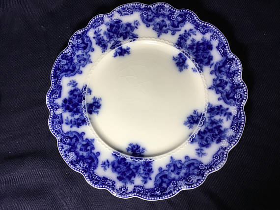
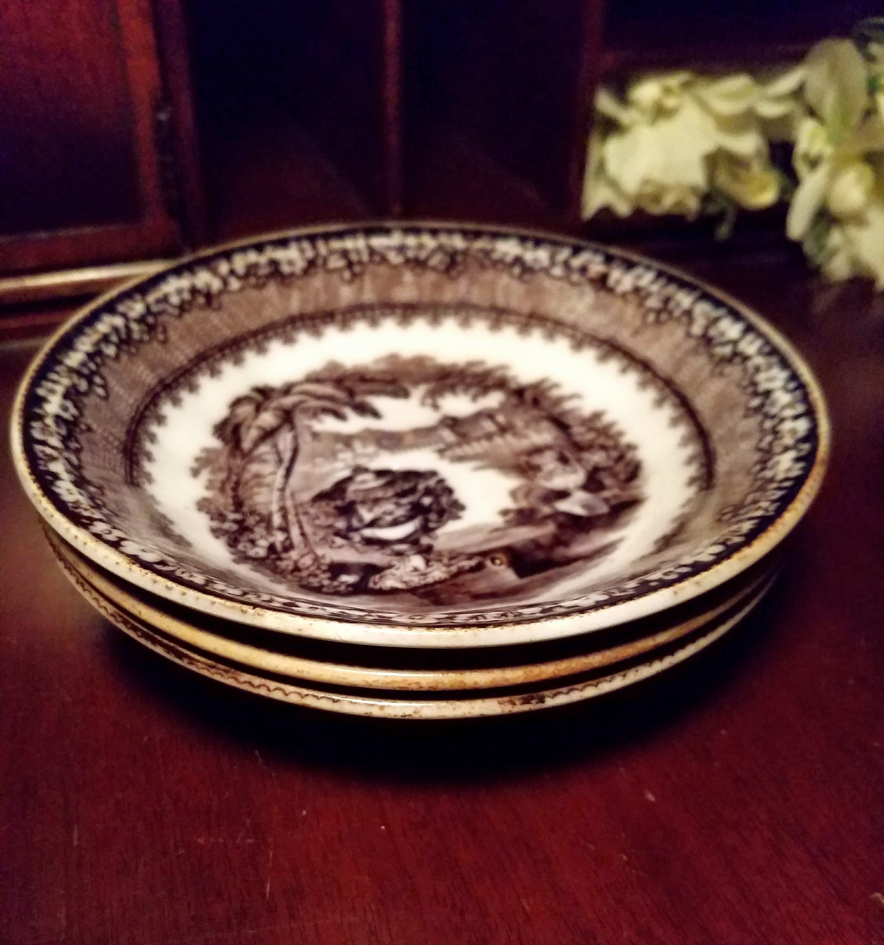
Black Flow Washington Vase Wedgwood Saucers
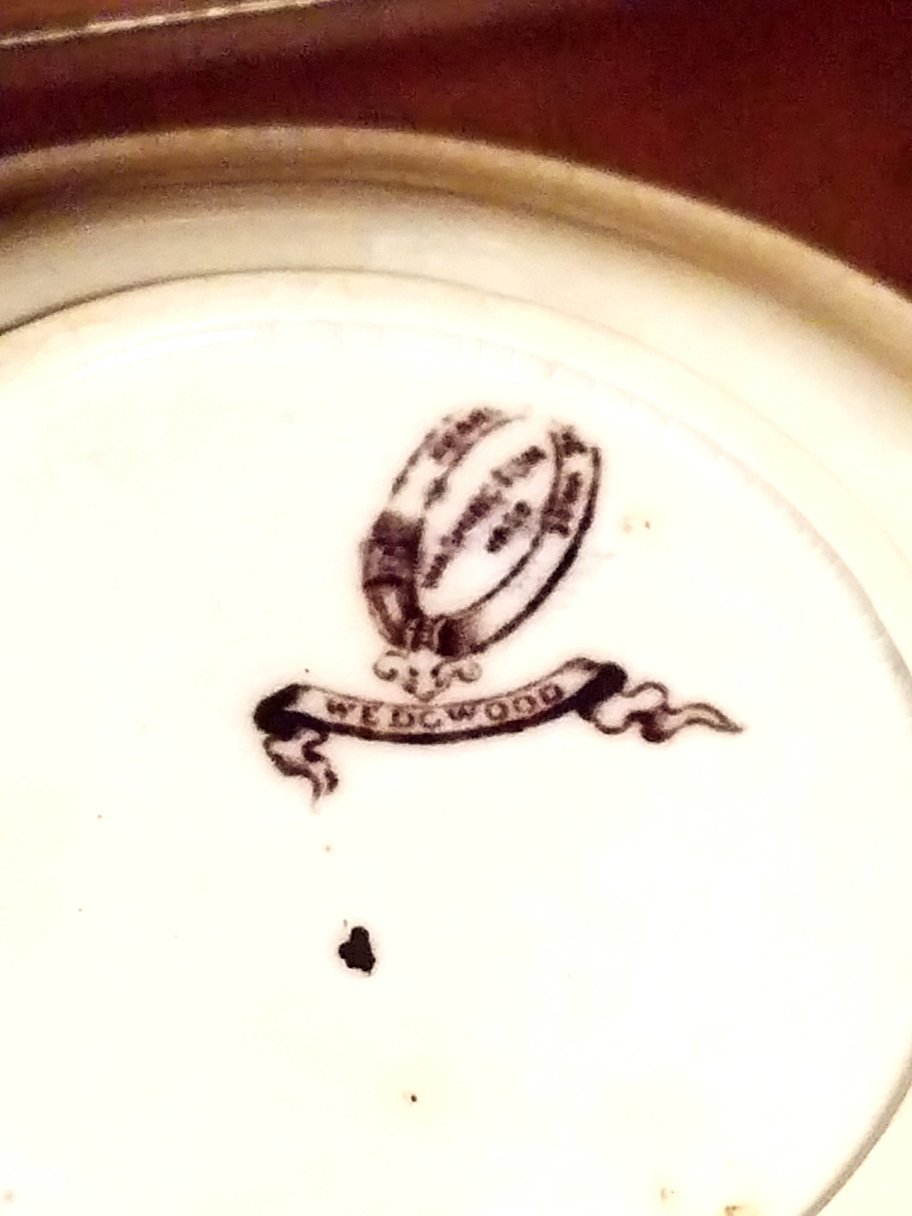
In researching them, I could see they are marked “Wedgwood” and “Pearl Stone Ware.” They are also marked “Washington Vase” which turns out to be the pattern name. But these are not Flow Blue, they are Flow Black! And gorgeous!
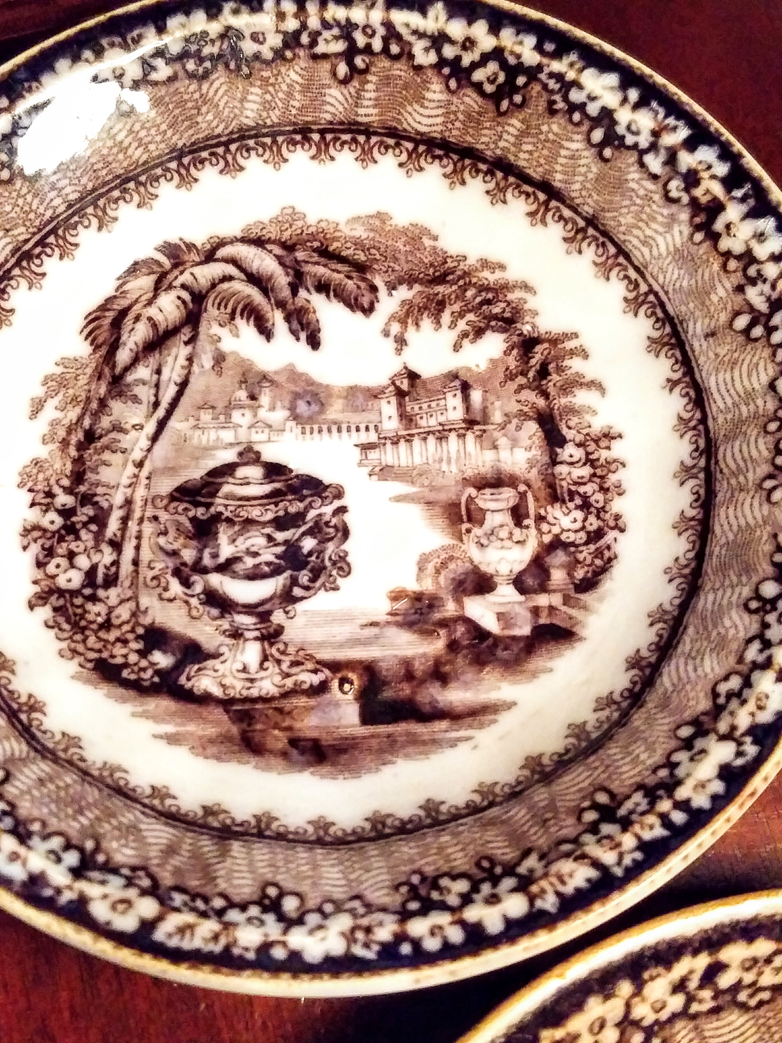
Black Flow Saucer Trio
These date back to about 1860, so they are over 150 years old. There was a bit of yellowing on a couple of them but you can see one that I believe was the original color. It was a white glaze with a black transfer that was “blurred” in the creation of the Flow Black pattern. The earliest Flow Black Washington Vase was done by a company named Podmore, Walker & Company (PW & Co.) which then became Wedgwood around the 1860s when Enoch Wedgwood became the senior partner during the acquisition of PW & Co.
You will see the PW & Co. mark on Washington Vase from the early 1800s and then around 1860 you will see it marked Wedgwood using the same backstamp, an oval and ribbon. Pearl Stone Ware, which is the other mark on these saucers, was marketed by PW & Co. as a more durable earthenware, being fired at a higher temperature. Since these particular saucers managed to hang in there for 150 years, I guess that it is pretty strong!!
Washington Vase Flow Black Wedgwood Mark
You will sometimes see Flow Black referred to as Mulberry. I saw black but perhaps others see a slightly maroon tinge.
I hope you have enjoyed learning about this beautiful transferware and will be able to identify it when you see it. It’s very collectible! If you have any stories about your Flow Black or Flow Blue, leave me a comment. Have a great week!
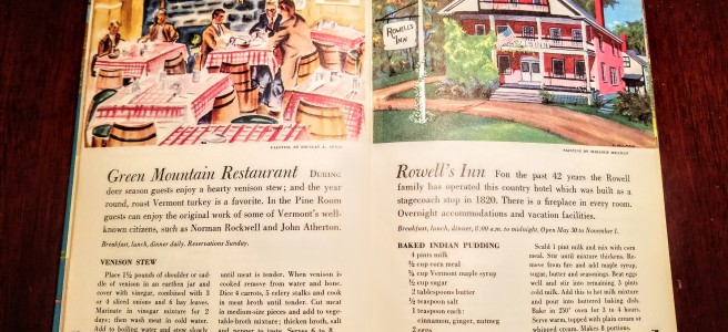
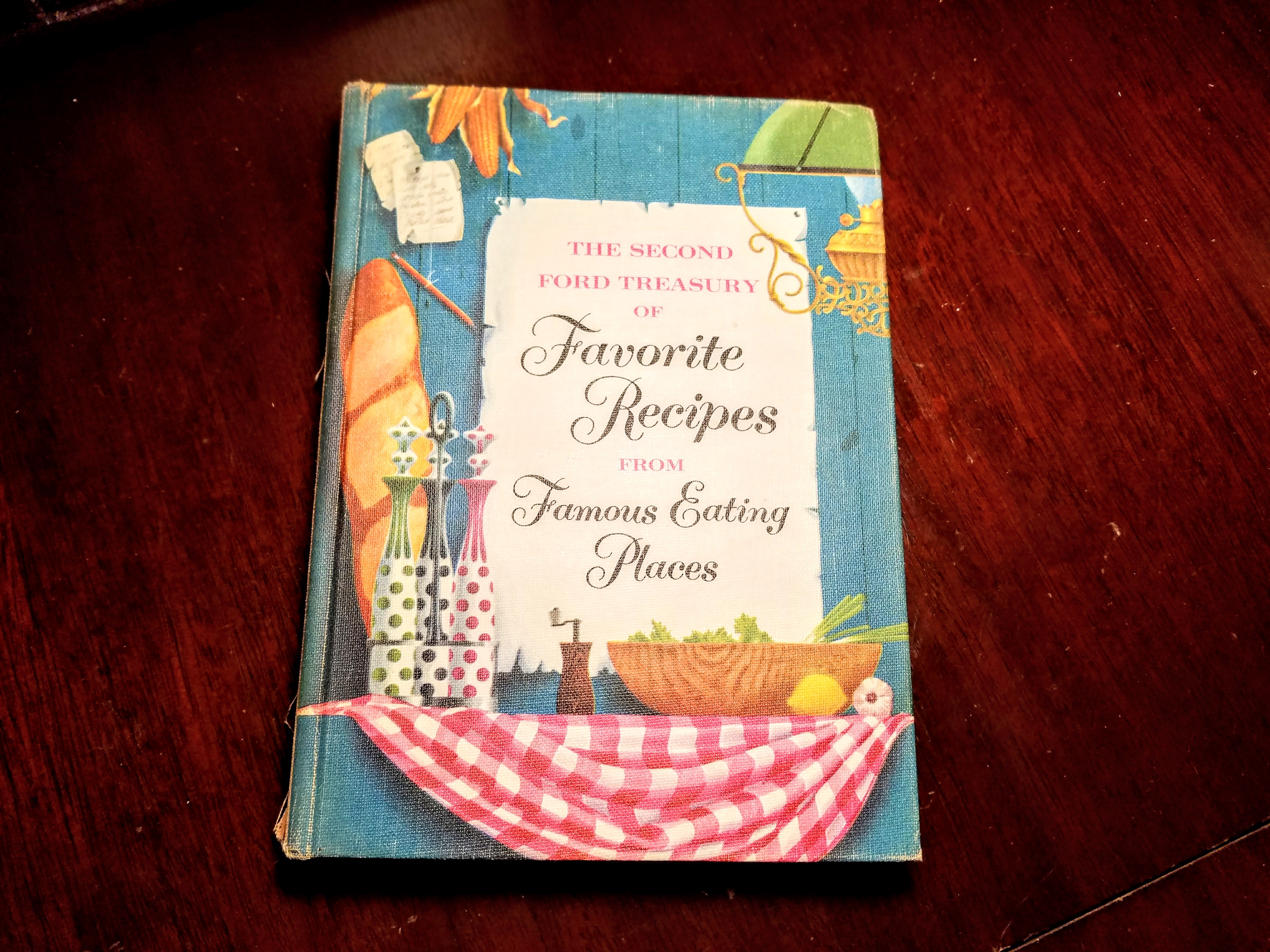
One of the things I love to find while I’m out and about are vintage cookbooks for a couple of reasons. One being that they sell well in my Etsy shop, the other is that I love thumbing through these vintage books looking at pictures from my childhood and before. Take a look at this one I found recently which I adore.
Famous Eating Places
Those graphics!!!!
It’s actually a cross-collectible for those that collect automobile memorabilia since it was put out by the Ford and Lincoln-Mercury Dealerships back in 1954. I love that there are 4 recipes from my state and many more from all over the United States. One of the restaurants is still standing in Portsmouth, NH, but is not a restaurant anymore, it’s a business. Time marches on.
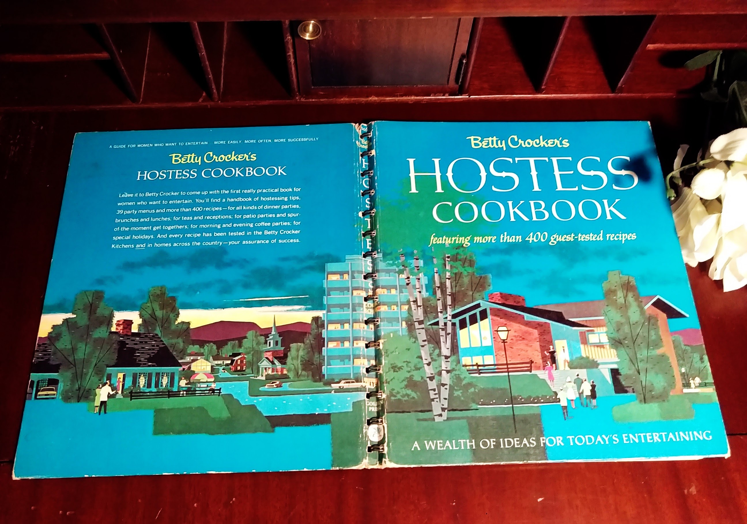
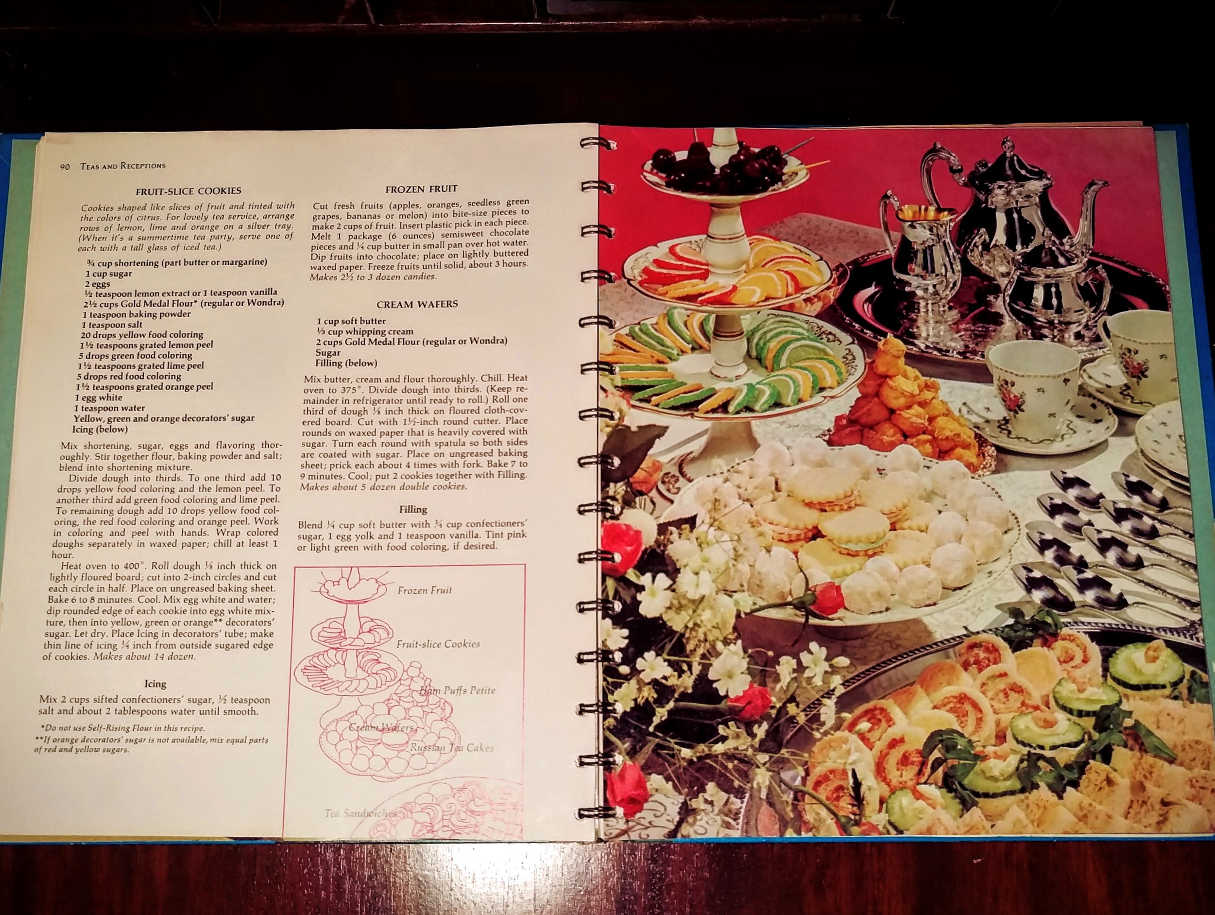
Here is another one that I really like.
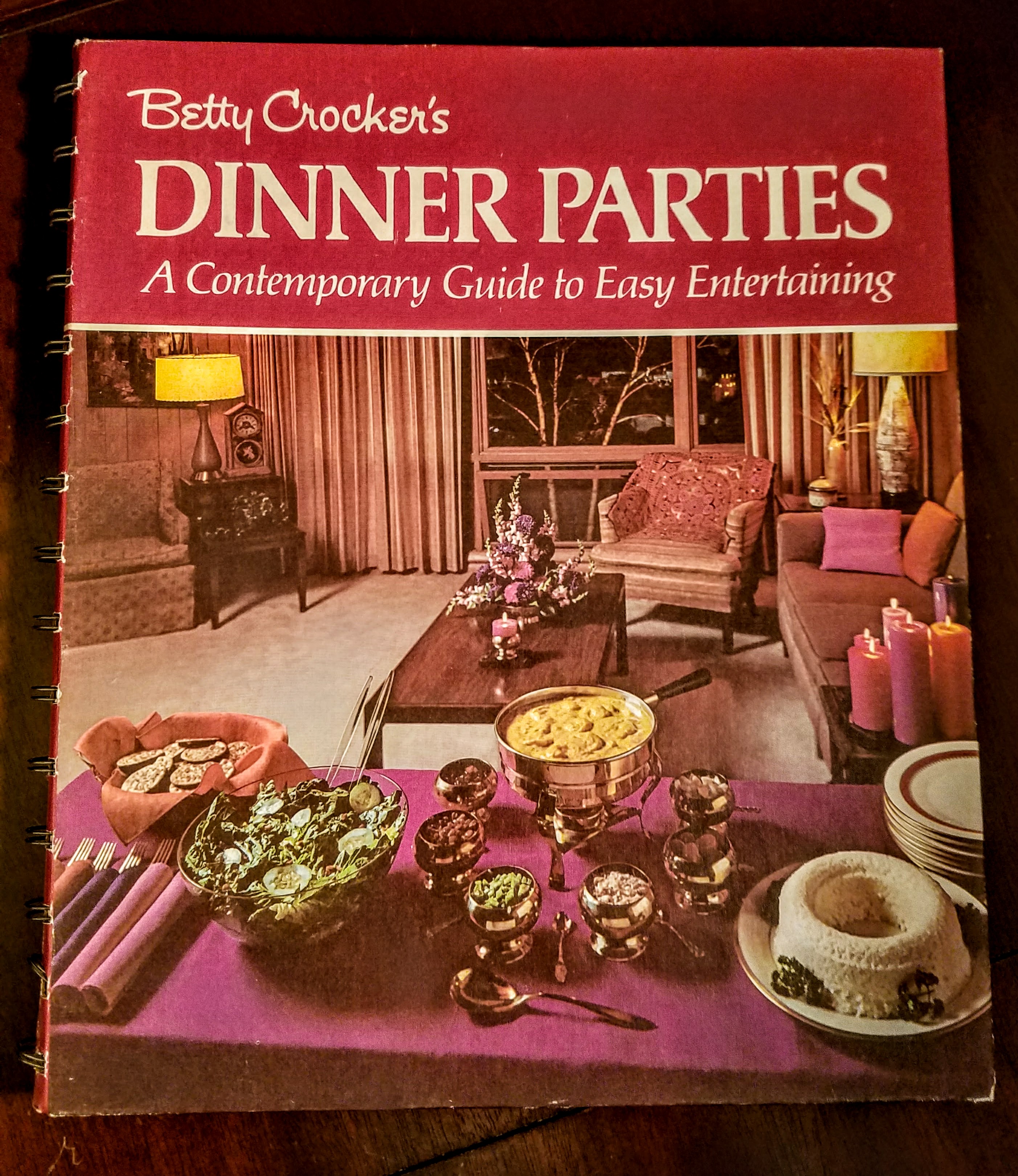
Betty Crocker helps you with all your hostess needs!
These Betty Crocker books have great pictures and recipes. Look at that spread!
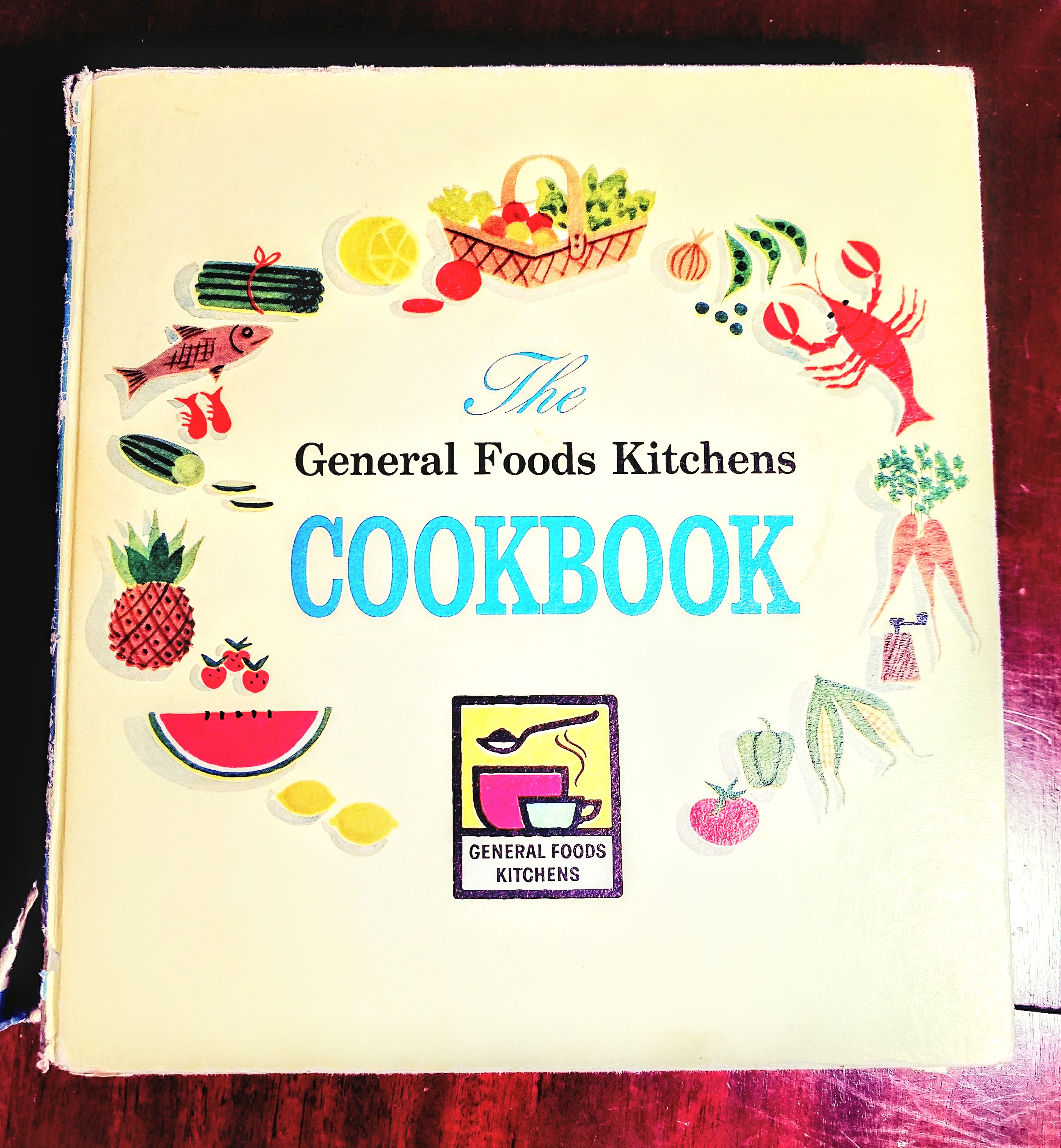
Here is another from Betty.
Not sure what that white ring is but I’m all in for that fondue!!
I especially like cookbooks from the 1950s and 1960s. And if you’ve read my many blog entries, you know I love Mid-Century stuff. And that includes cookbooks.
Although, here’s an oldy. A reproduction from the early Williamsburg days.
Close up!
Close up!
Obviously, people have been writing down recipes for a long time. Did you know that the oldest recipes ever found were written on clay tablets? Called the Yale Culinary Tablets, they date back to 1700 B.C. They only list the ingredients though and not the directions (Yale Tablets). It was sort of a crap shoot I guess if you got it right. Click the link for more info.
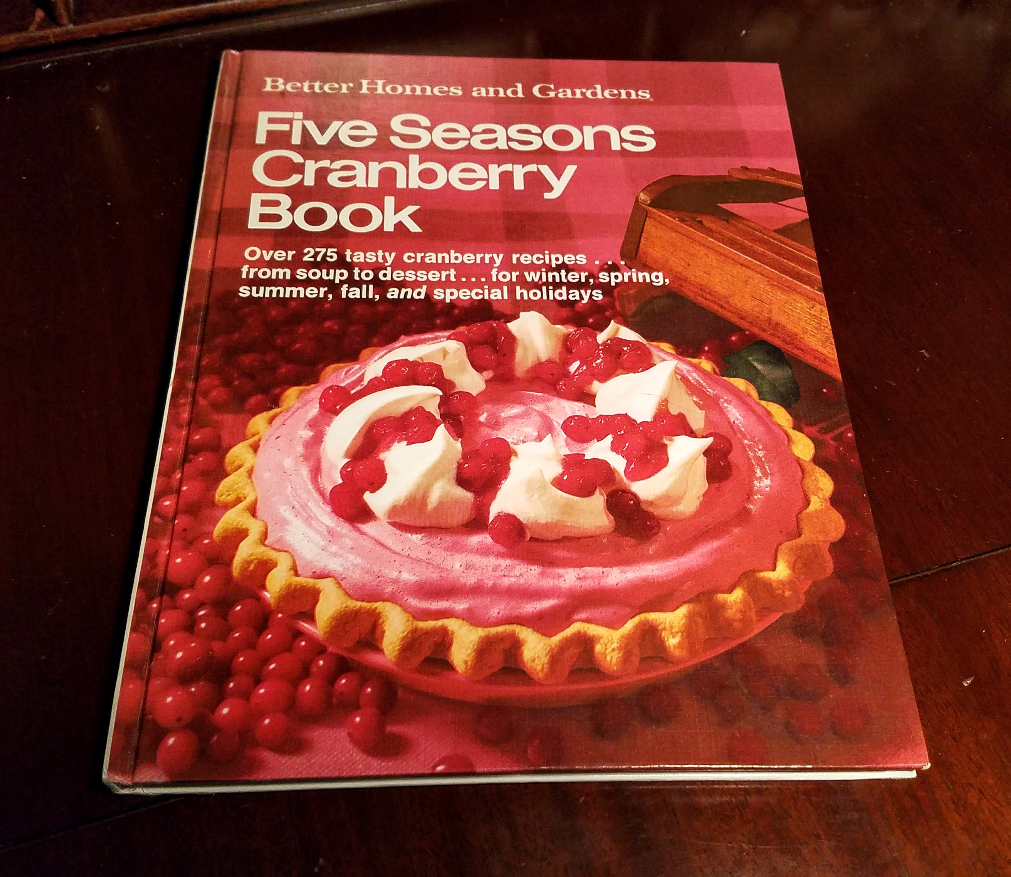
Here’s one that is relevant for the upcoming Thanksgiving holiday!
Who knew the cranberry was so versatile!
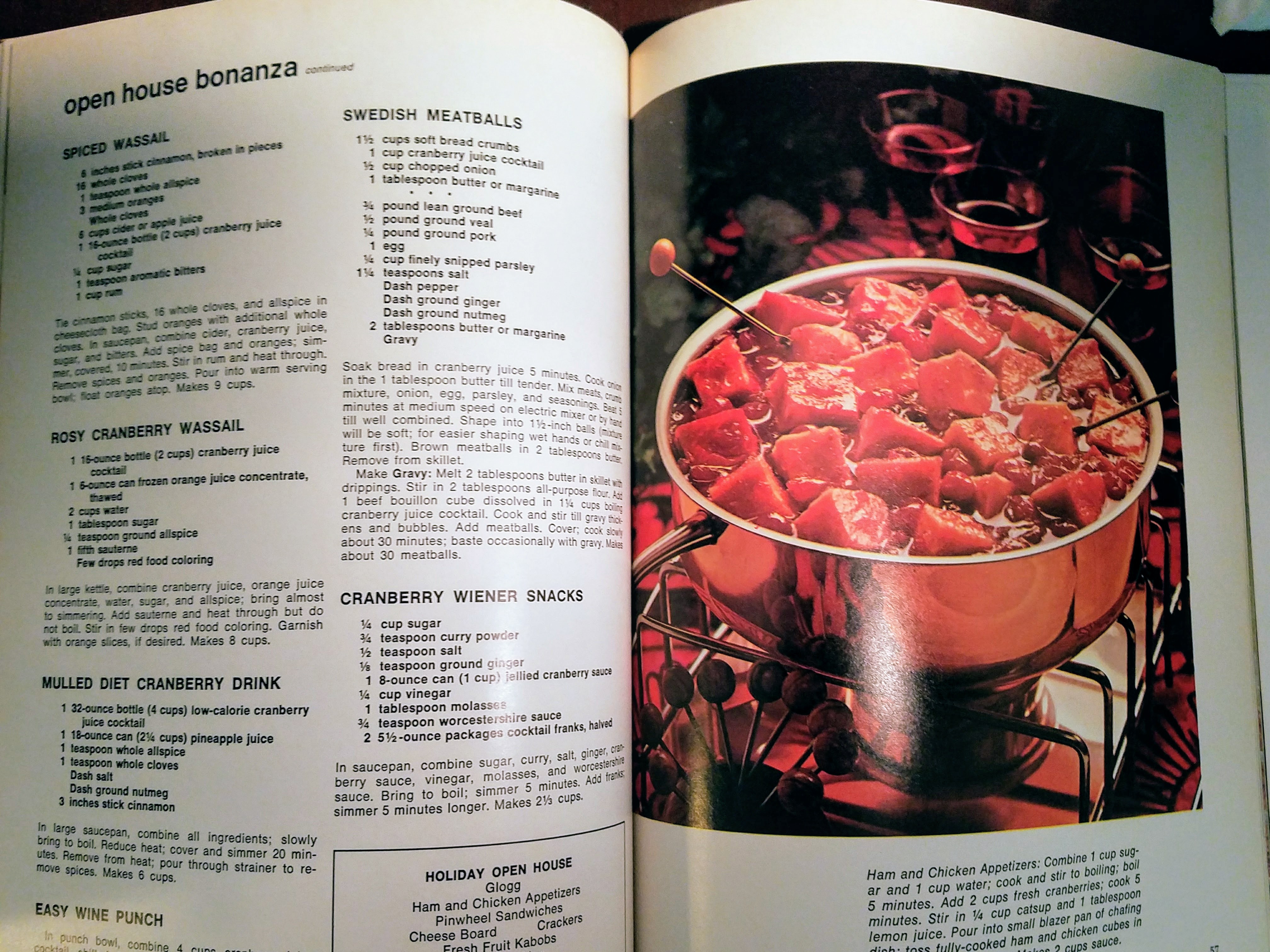
Free Recipes!
Does anyone remember the Galloping Gourmet? I remember my dad watching this show on Saturday afternoons.
There he is! Not my dad, the Galloping Gourmet!
There are so many different kinds of cookbooks. One that recently sold in the shop was from the 1960s that was a compilation of Boston Globe recipes. I almost didn’t let that one go. One that I am keeping for now because I need more time to explore it is this one.
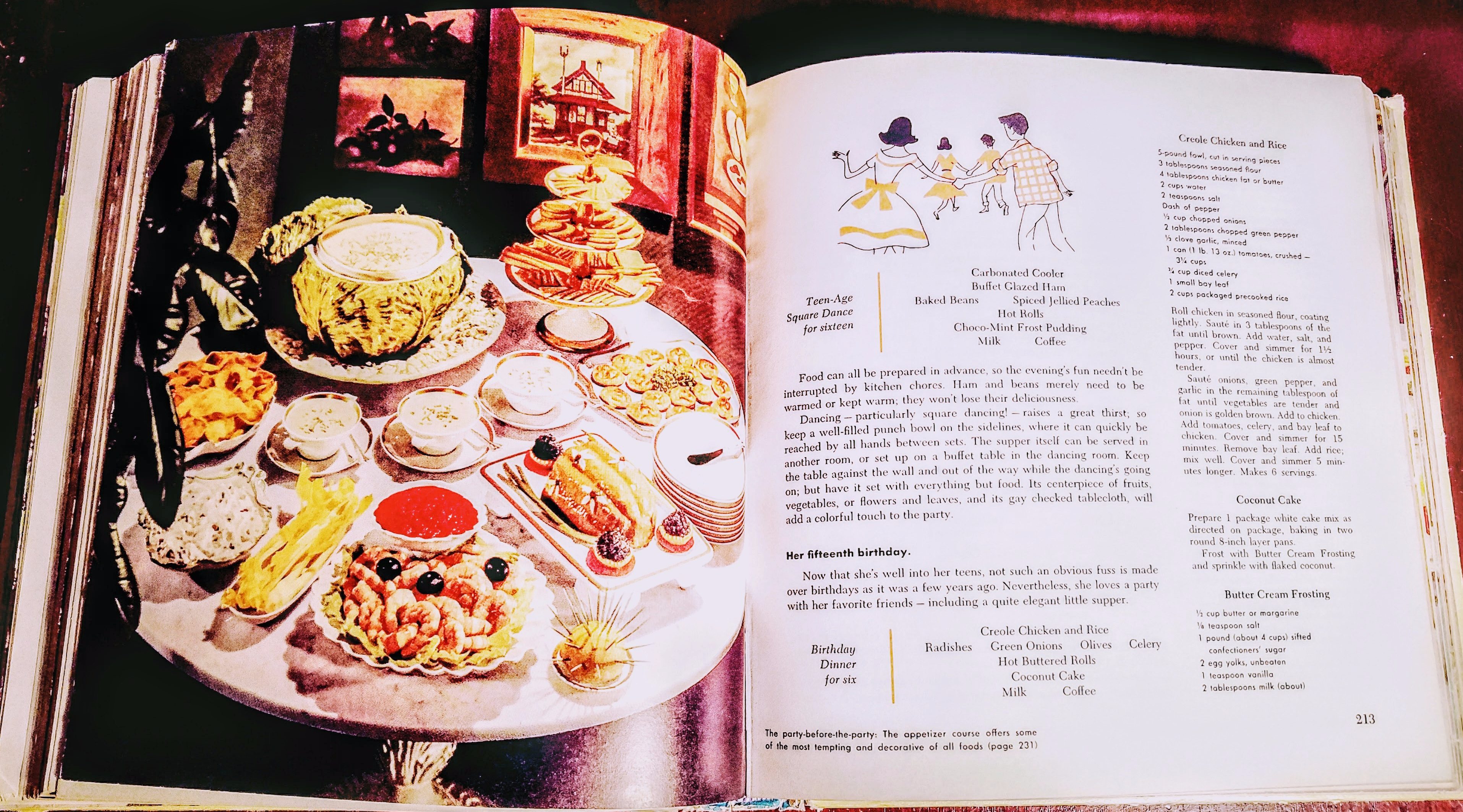
Anyone need a recipe for a Teen-Age Square Dance?! Here’s one!
I like the way it reads like a story and I want to try some of the recipes. This one is interesting in that it was written in 1959 and it has a section on cooking for food allergies and another section warning about fad diets. I didn’t think they knew about those issues back then! So I’ll hang on to this one.
Well, I thank you for taking the time to enjoy these great vintage cookbooks with me. Most of them (not all) are available in the Vintage Eve’s shop on Etsy. As always, have a wonderful day and maybe try a new (old) recipe!! If you do, drop me a line and let me know what you made. Always looking for something different to answer that age-old question … what’s for dinner?! My kids don’t even have to wait til I get home to ask anymore, they text me that question now. Time does indeed march on but the question remains the same. Have a great week!